Grey boxes full of grey boxes.
Fascinating as it is, the world of data centers is not always the prettiest. Sure, there are a few good-looking facilities - and DCD has tried to highlight them with an award. But most data centers are giant, grey, windowless slabs tucked away behind barbed wire fences.
"They’re just big, blank boxes; they’re disgusting, they’re just so ugly and when I look at the picture of this one, it’s just one big white plane that’s not interesting," Santa Clara's Planning Commissioner Suds Jain said back in 2019, opposing a RagingWire data center proposal.
Inside them, things are only marginally better: Rows and rows of grey or black racks of identical machines in white rooms that all look very similar.
Professional photographer George Dunbar spent 32 years documenting IBM's IT, producing striking work which we profiled in our magazine, and here. But even he can't find anything to celebrate in today's data centers: "There's nothing to take a photograph of these days, because they're not very interesting."
Making data centers beautiful
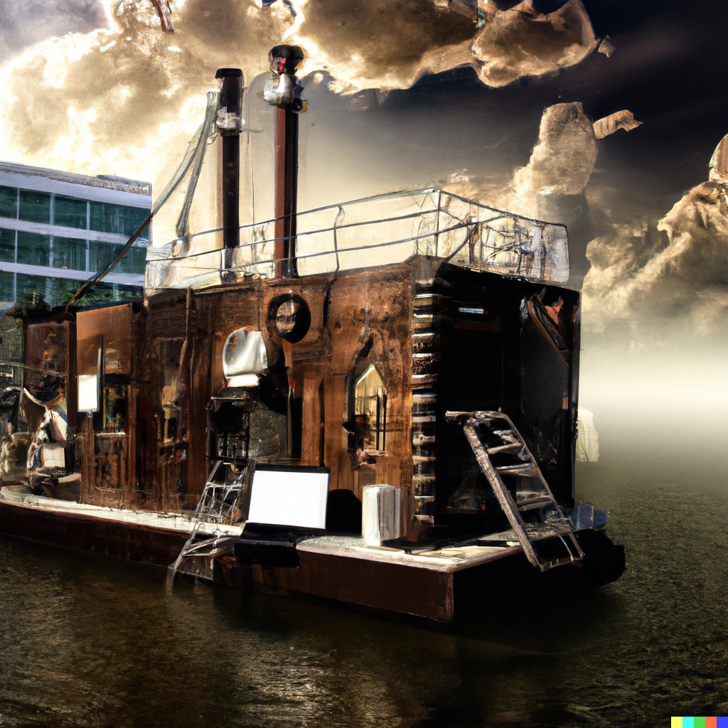
This may be a little harsh. After all, we have photographed some cool constructions, and explored stunning quantum computers, as well as some less well-conceived creations such as this pirate boat.
But still, we struggle with the sameness of data center internals, and the blandness of their external designs, in every issue of the world's largest data center magazine.
We want the magazine to look as good as possible, so the content we pour our heart into gets the love it deserves. So we refuse to illustrate every feature with a hackneyed shot of an aisle of blinking racks shrinking into the distance.
To avoid the mundane, we invest as much as we can in our own photography, contract photography, and illustrators. That's still a lot of work and still doesn't always get the image we want. Wouldn't it be easier if someone else - or maybe something else - could just do it for us?
With that in mind, I eagerly signed up to use OpenAI's DALL·E 2 image creation system. Its promise is simple in concept, but incredibly complex in execution - you can use natural language to describe an image you want, and DALL·E tries to create it, giving four interpretations of your text.
Each image is a new creation, but borrows from a huge database of human-generated artworks and photographs, mushing them together to create something that appears original.
So is it good enough for DCD Magazine? You be the judge.
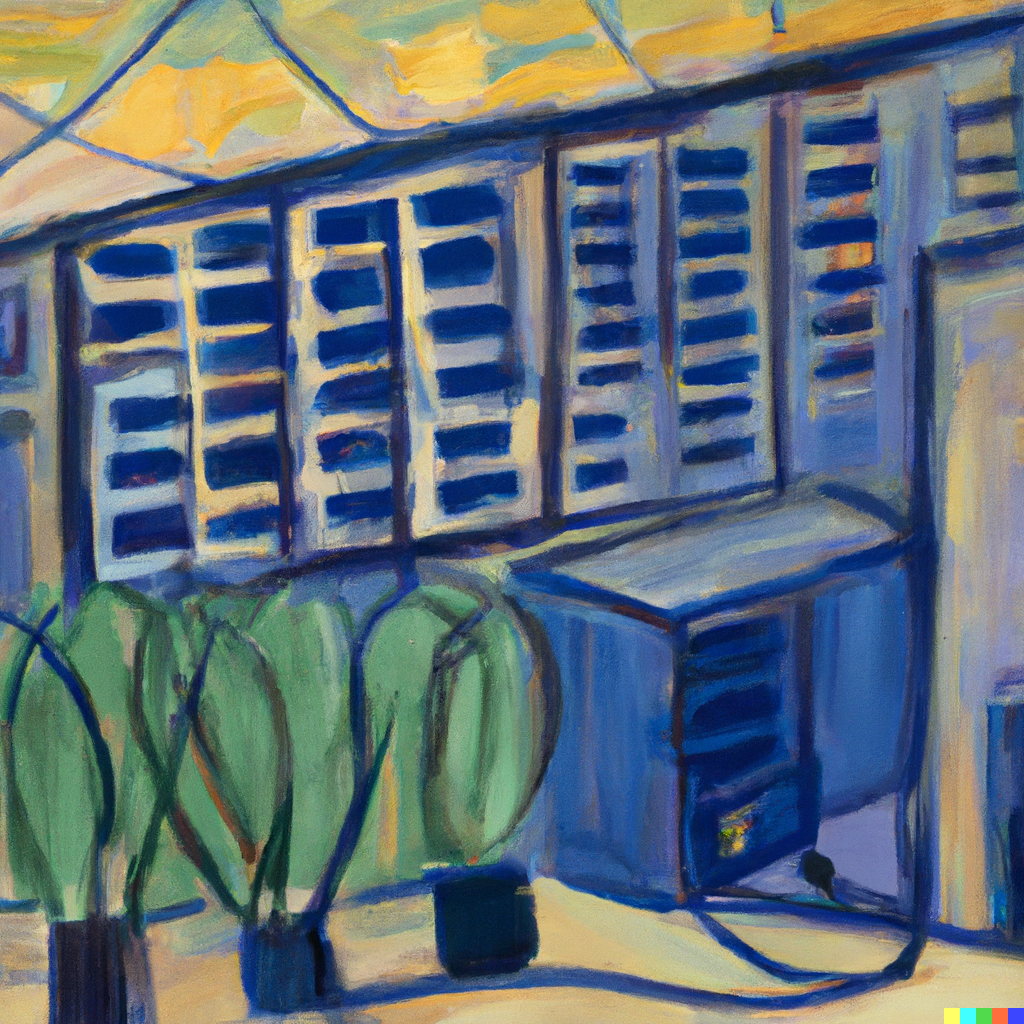
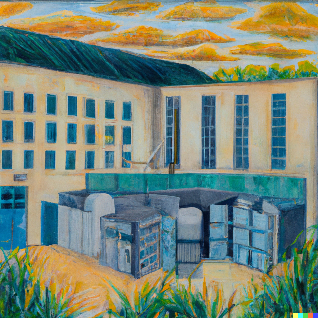
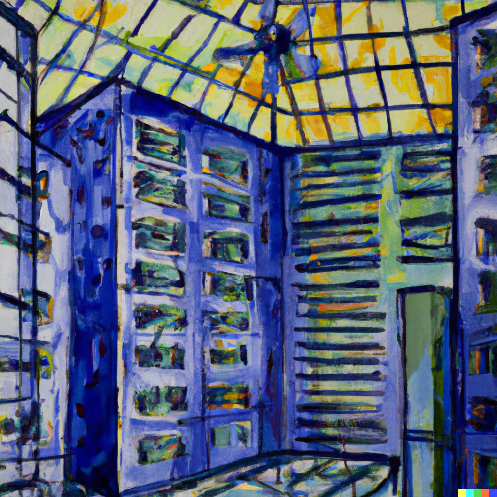
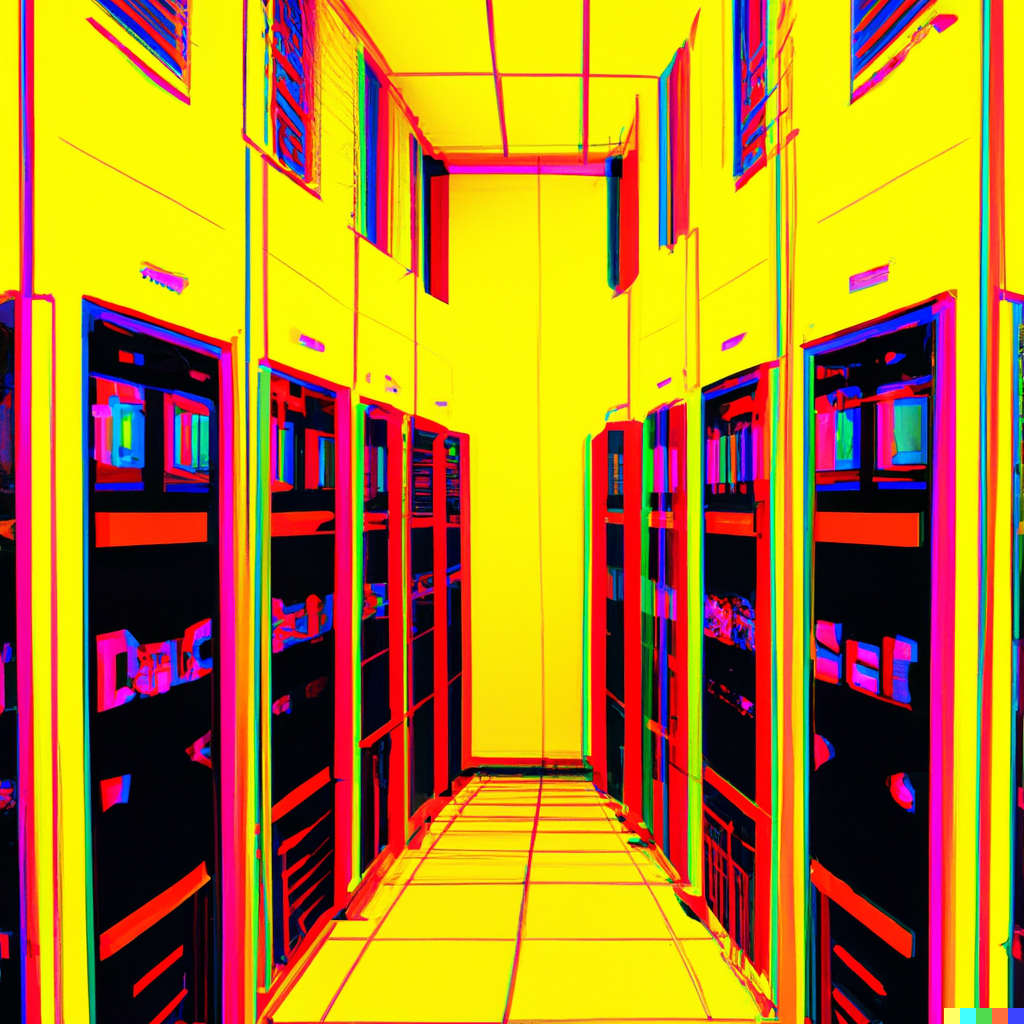
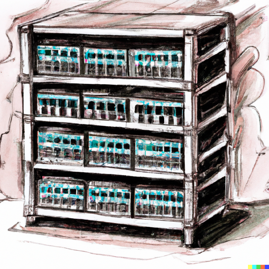
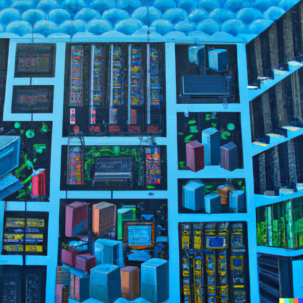
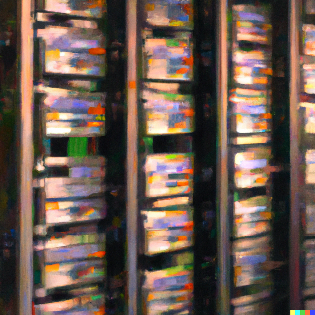
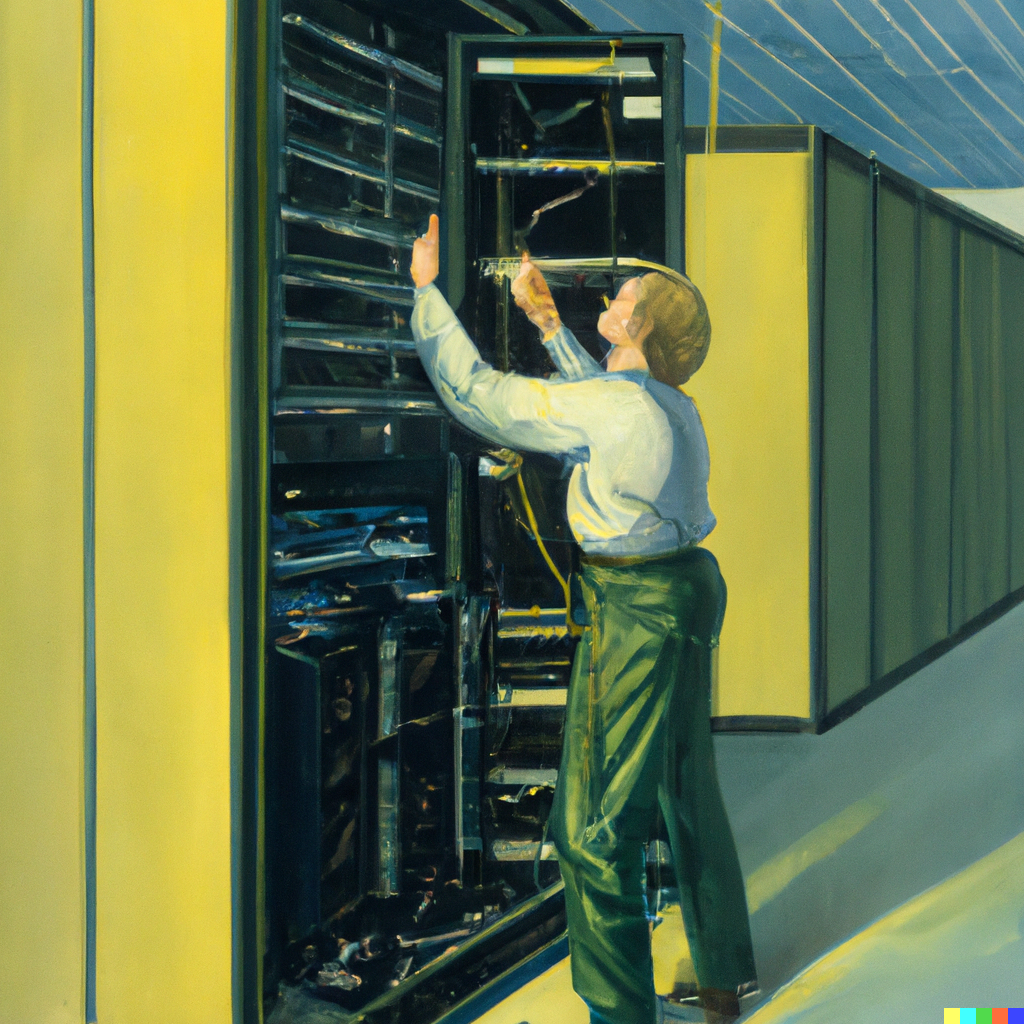
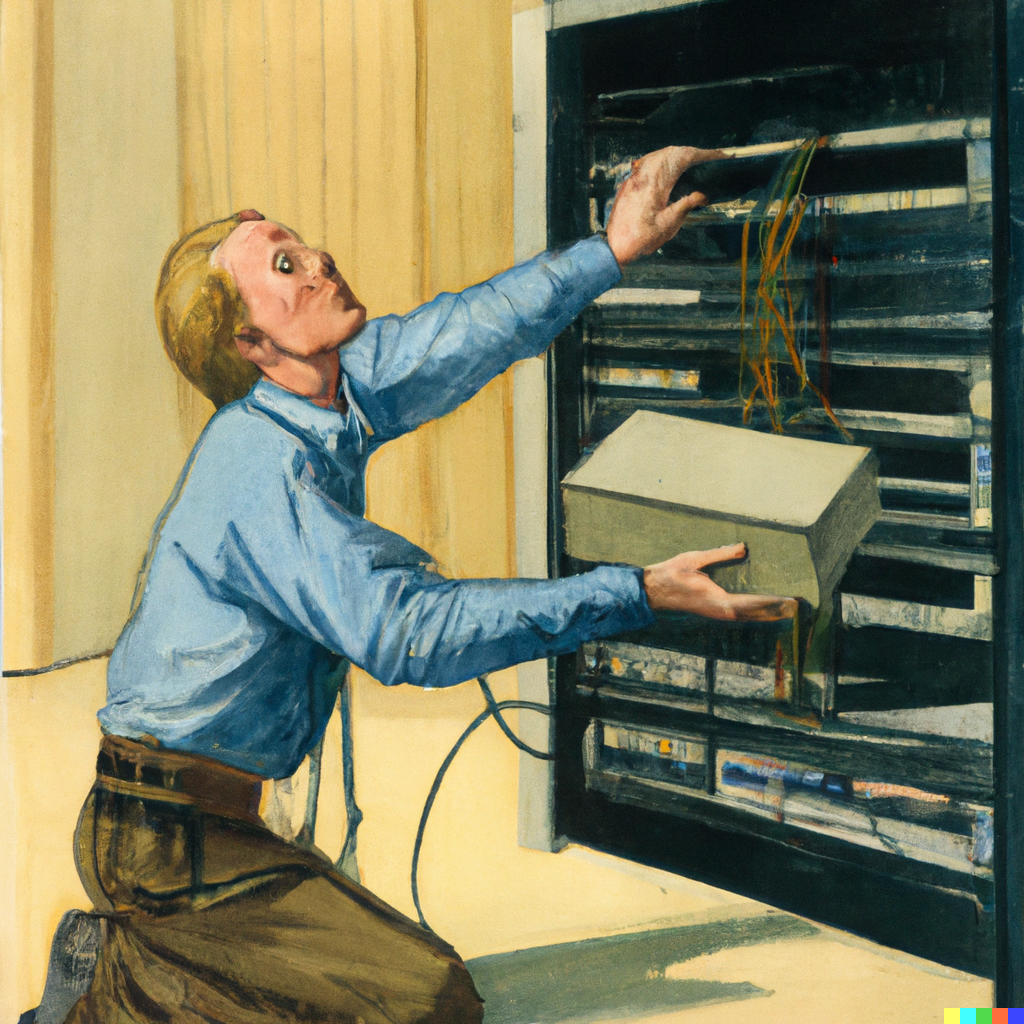
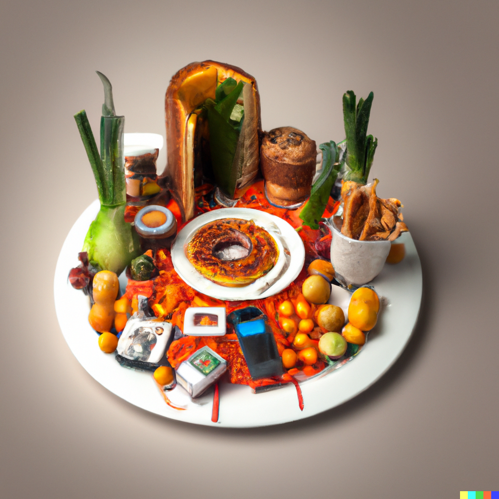
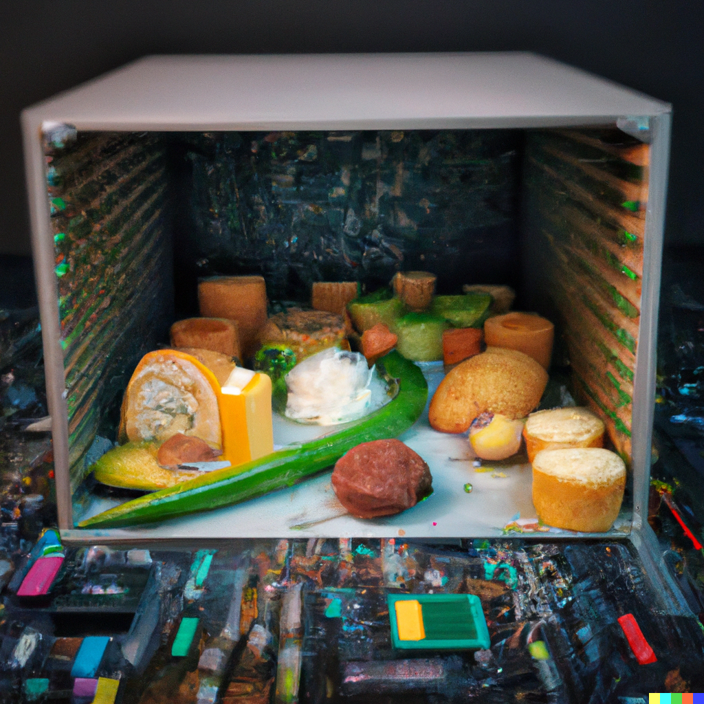
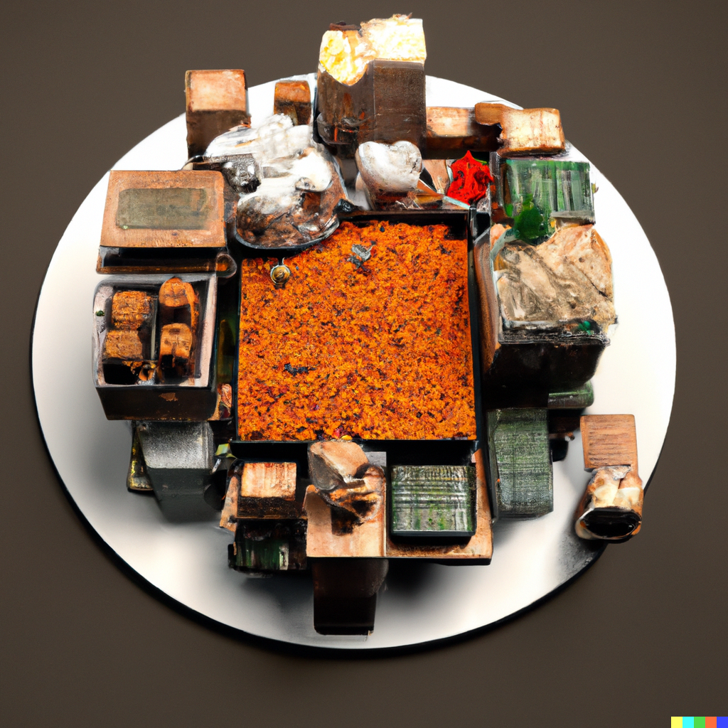
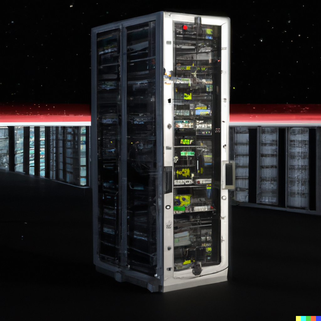
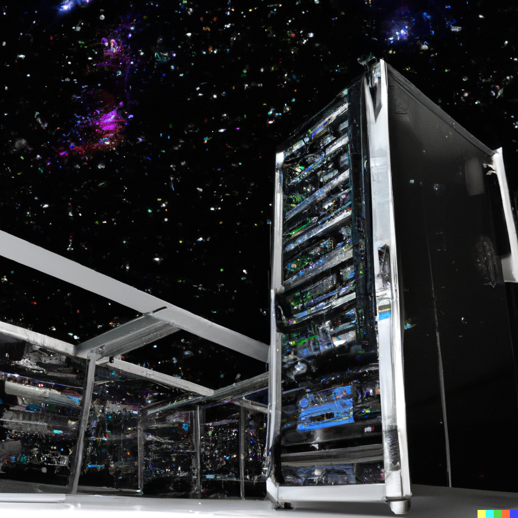
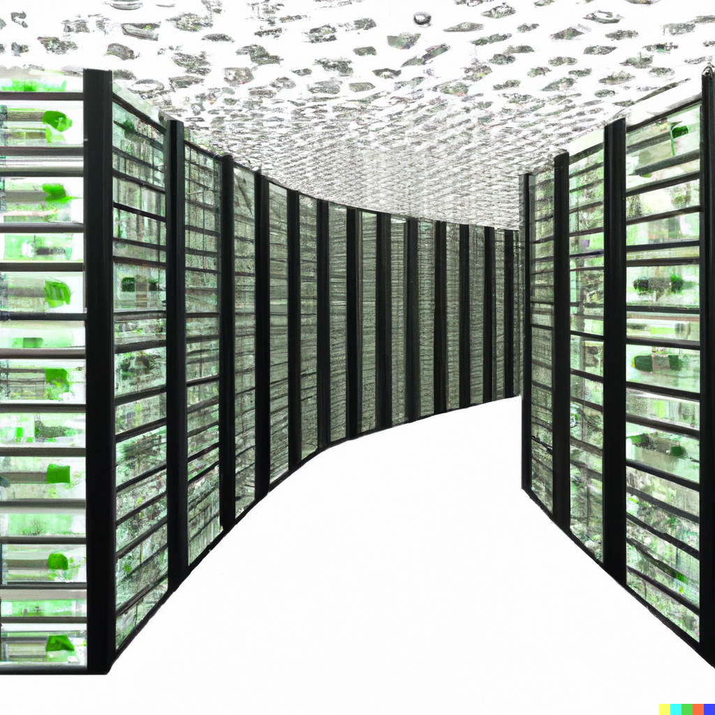
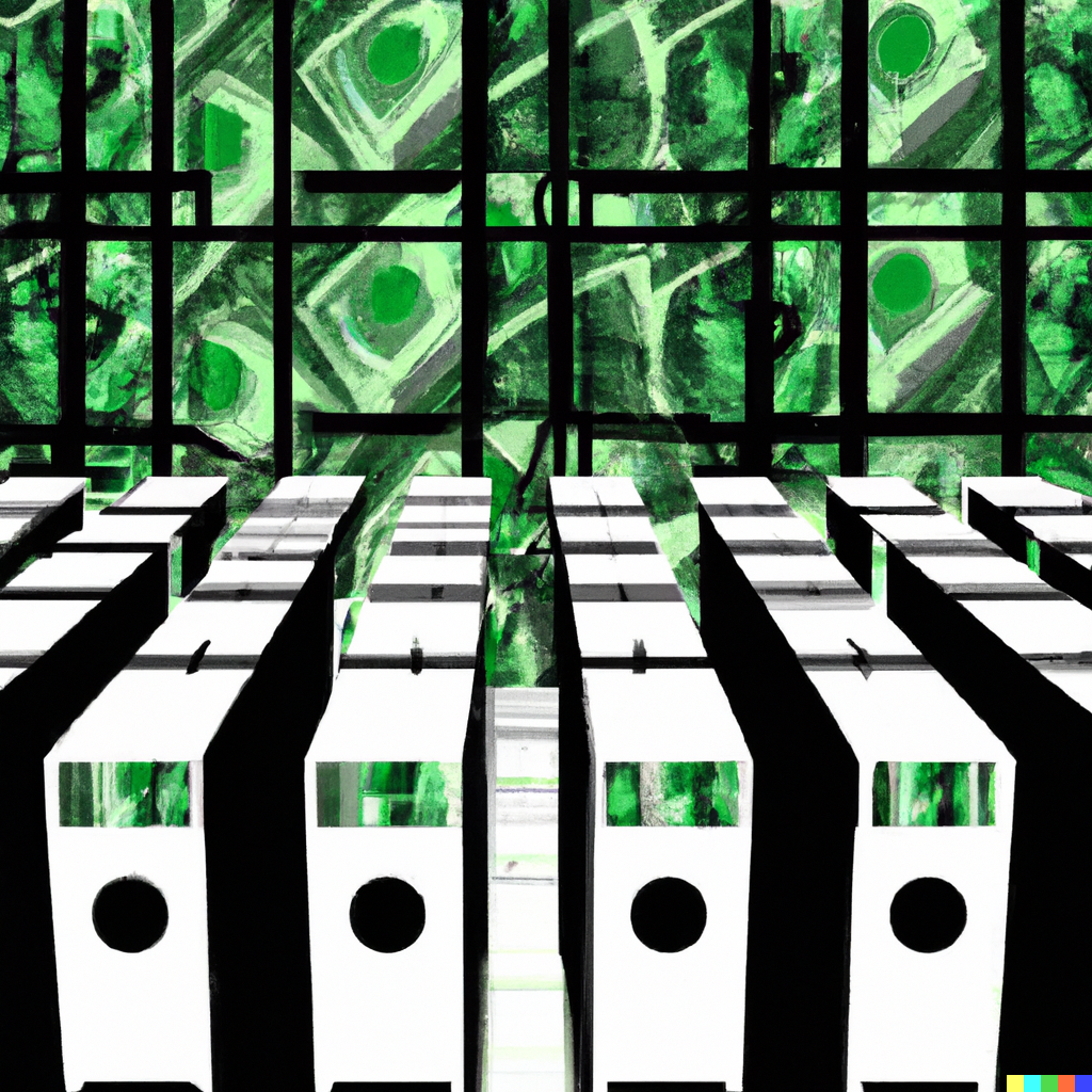
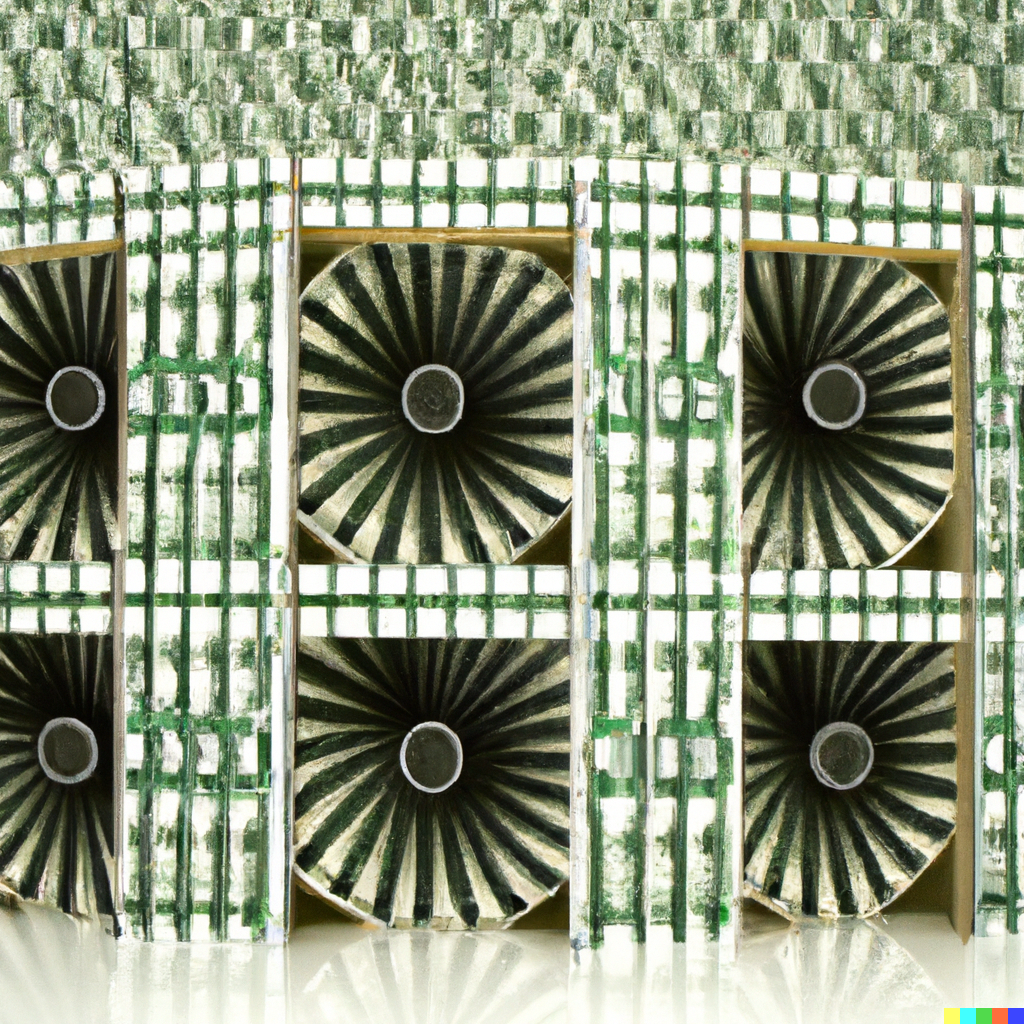
First, we asked it simply to create a data center:

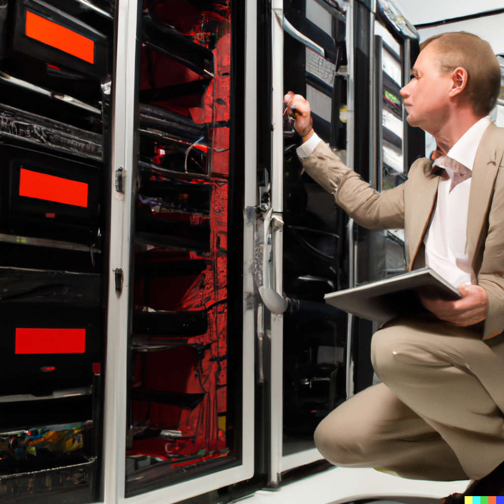

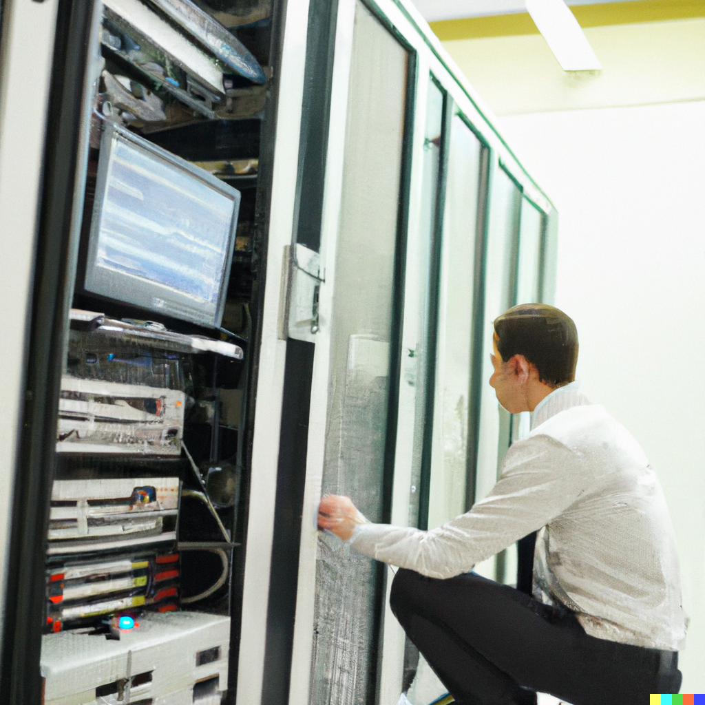
All are impressive, although already a core flaw is visible - the system does not appear to be great at faces (sometimes it does well, see below, but usually not), and also suffers on the finer details. As it scours millions of pictures of servers, it squishes them together, so they don't quite look like a cohesive product.
In this case, the images are also quite dull, borrowing from that long lineage of generic pictures to generate an equally generic end result. That's not going to make for a distinctive look in the magazine.
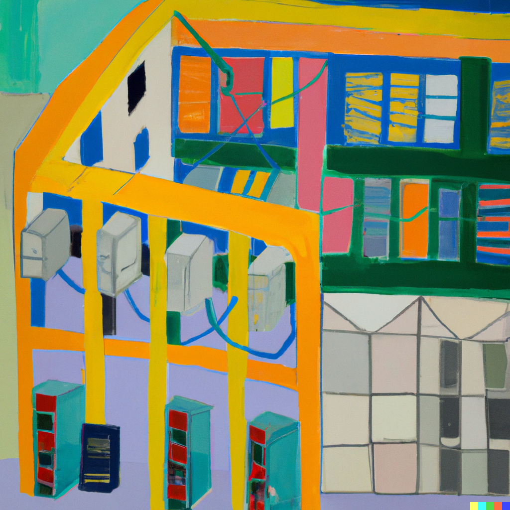
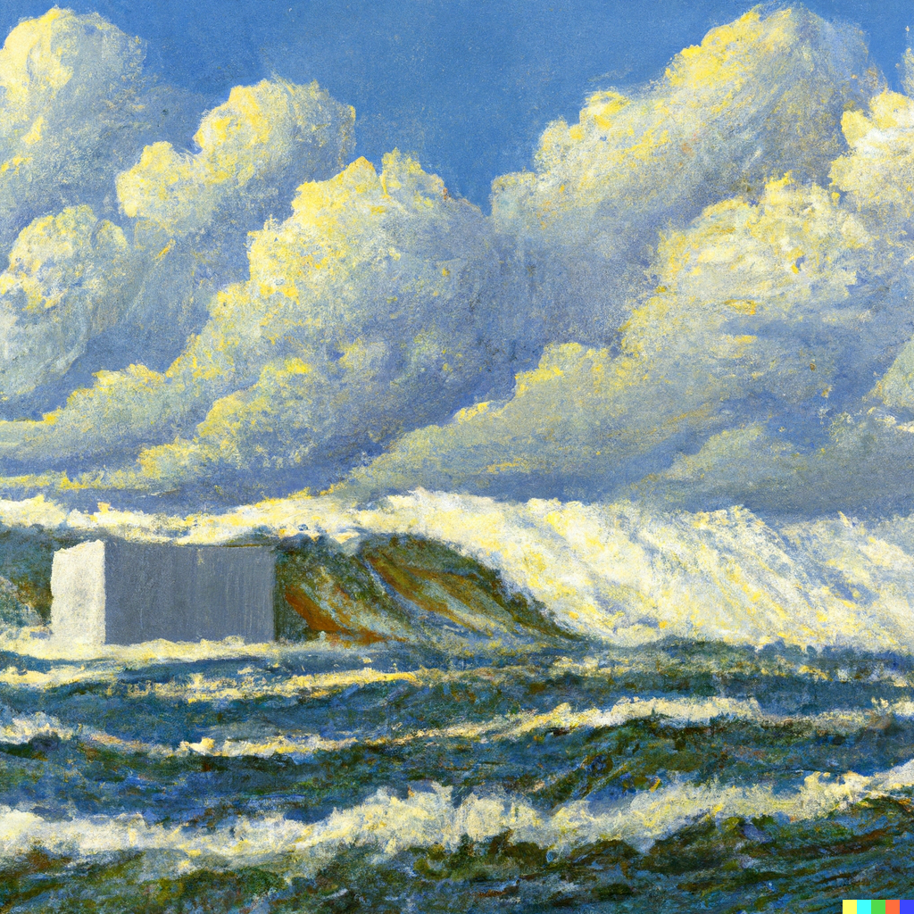
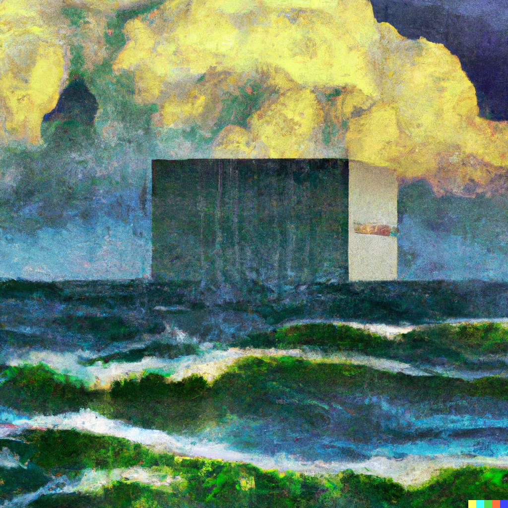
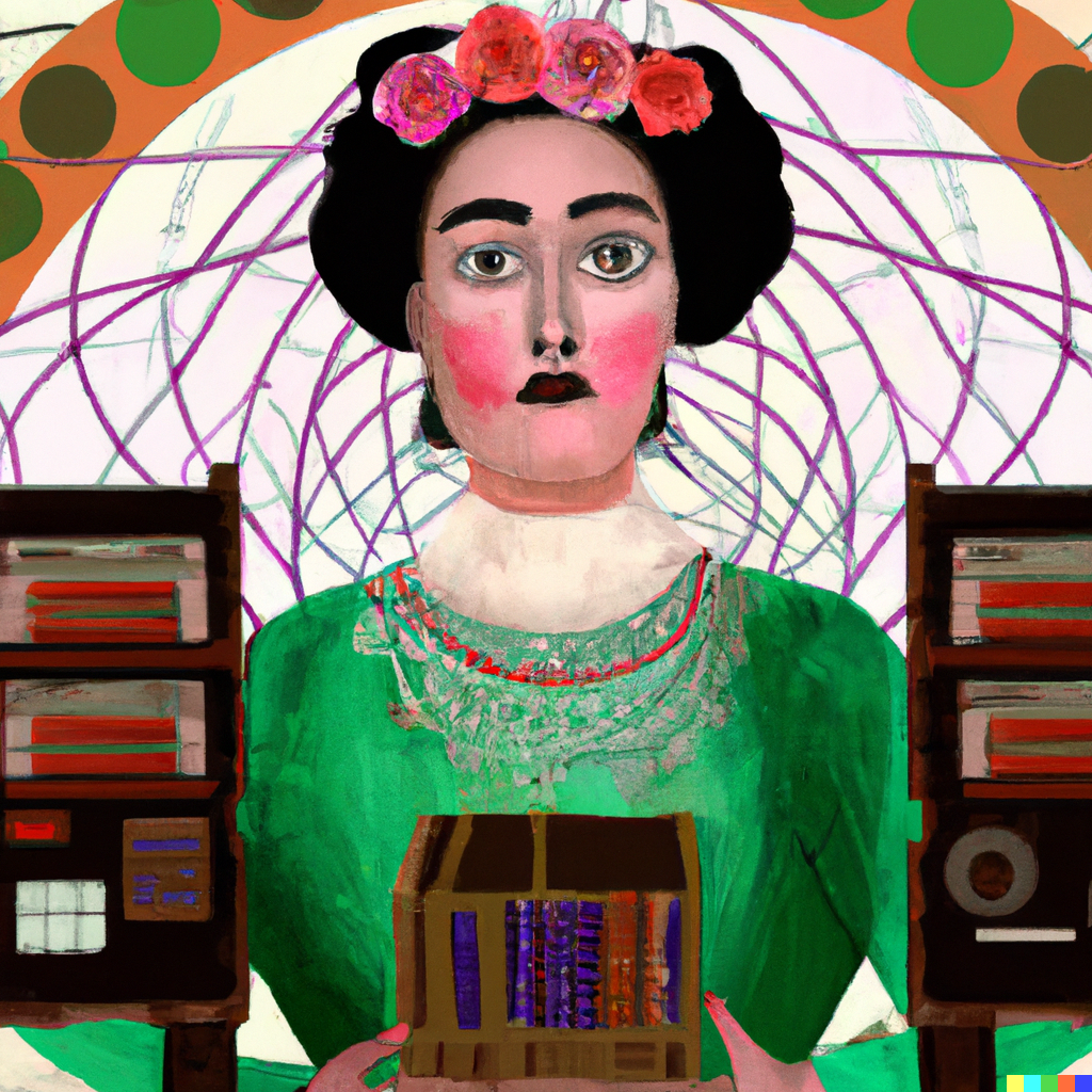
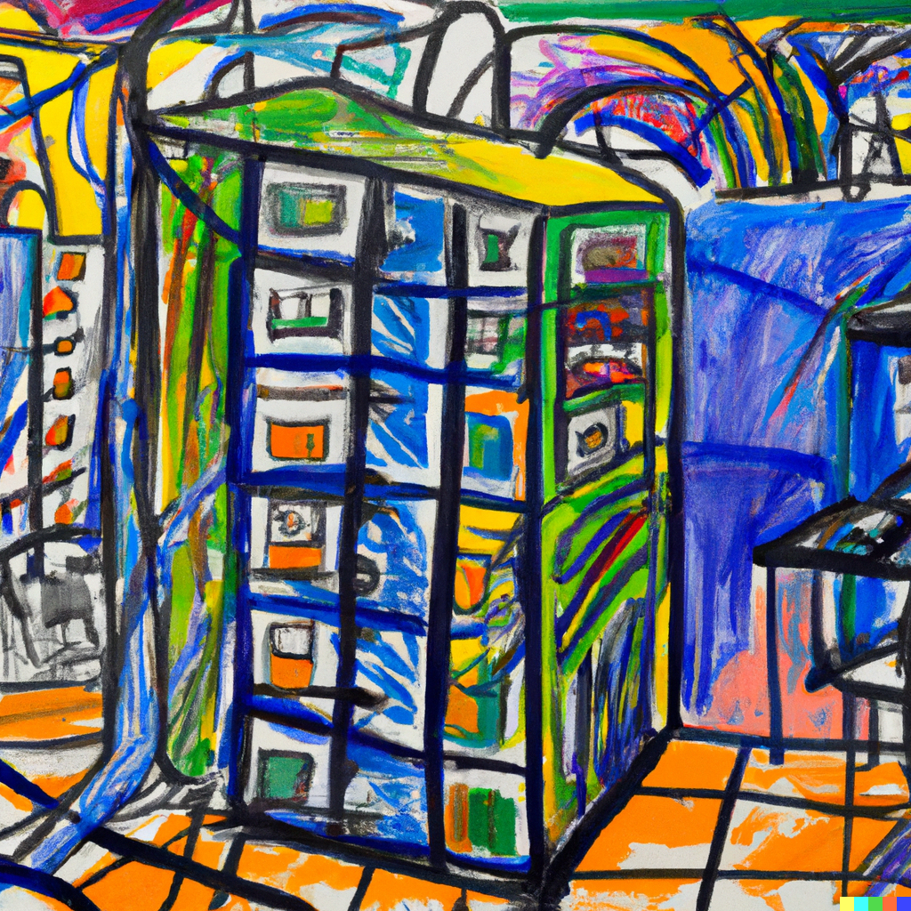
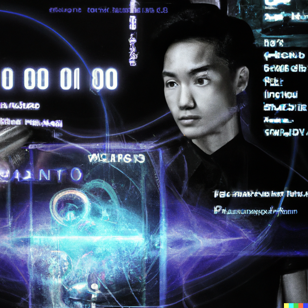
DALL·E works better the more prompts you give it to work with - such as when you ask it to create in the style of a famous artist.
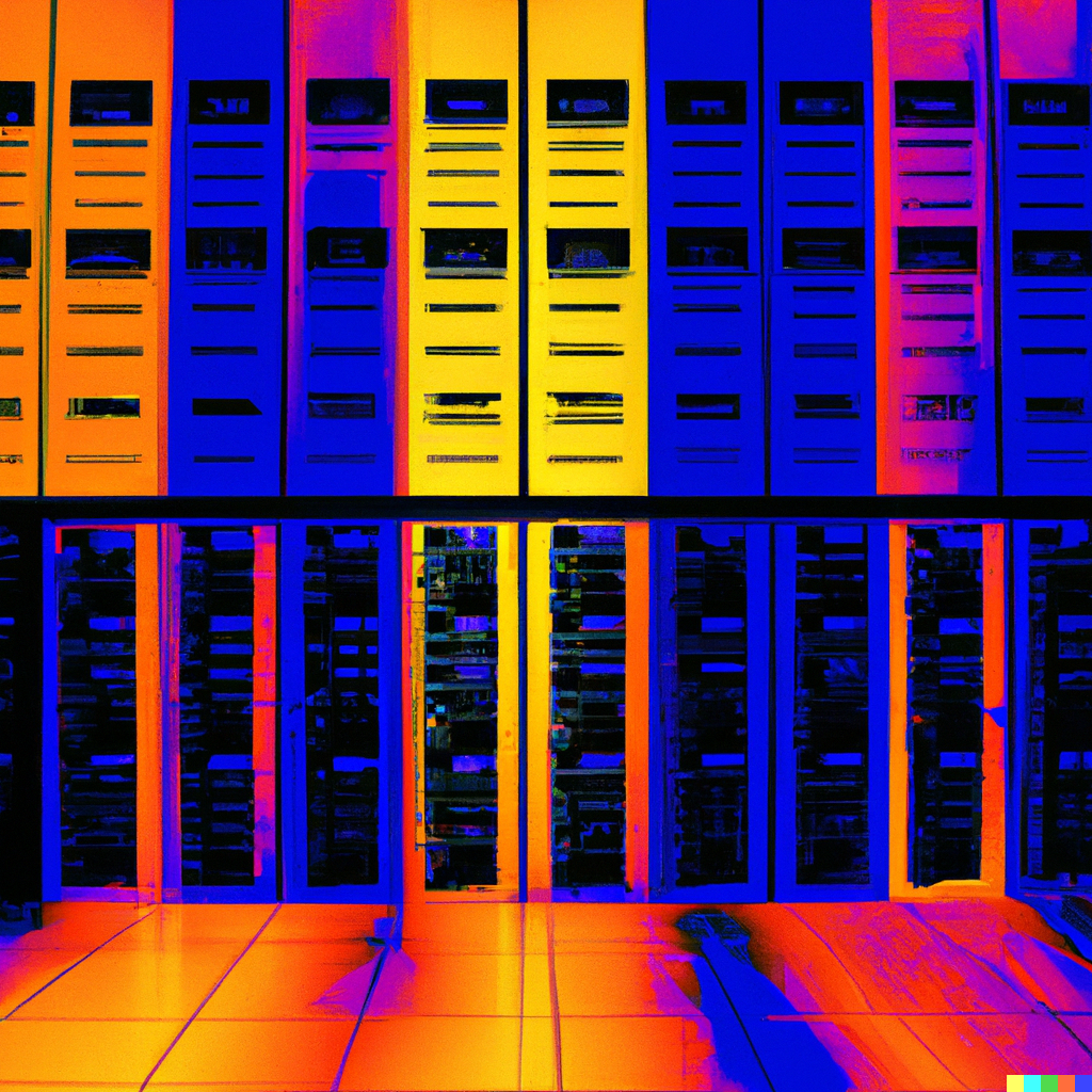
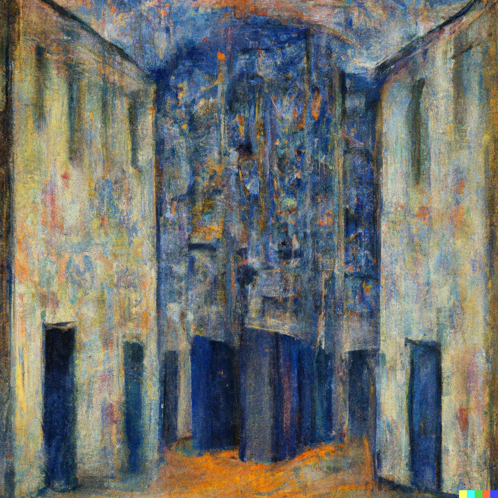
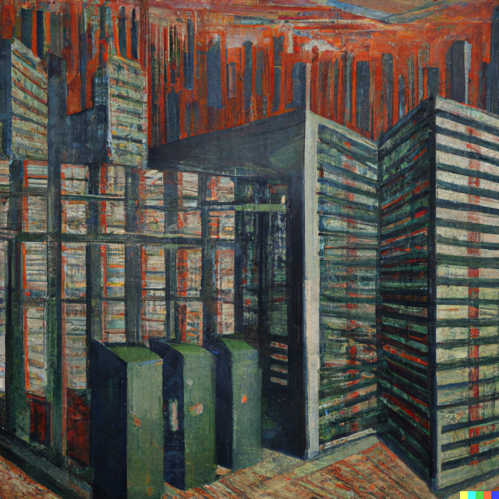
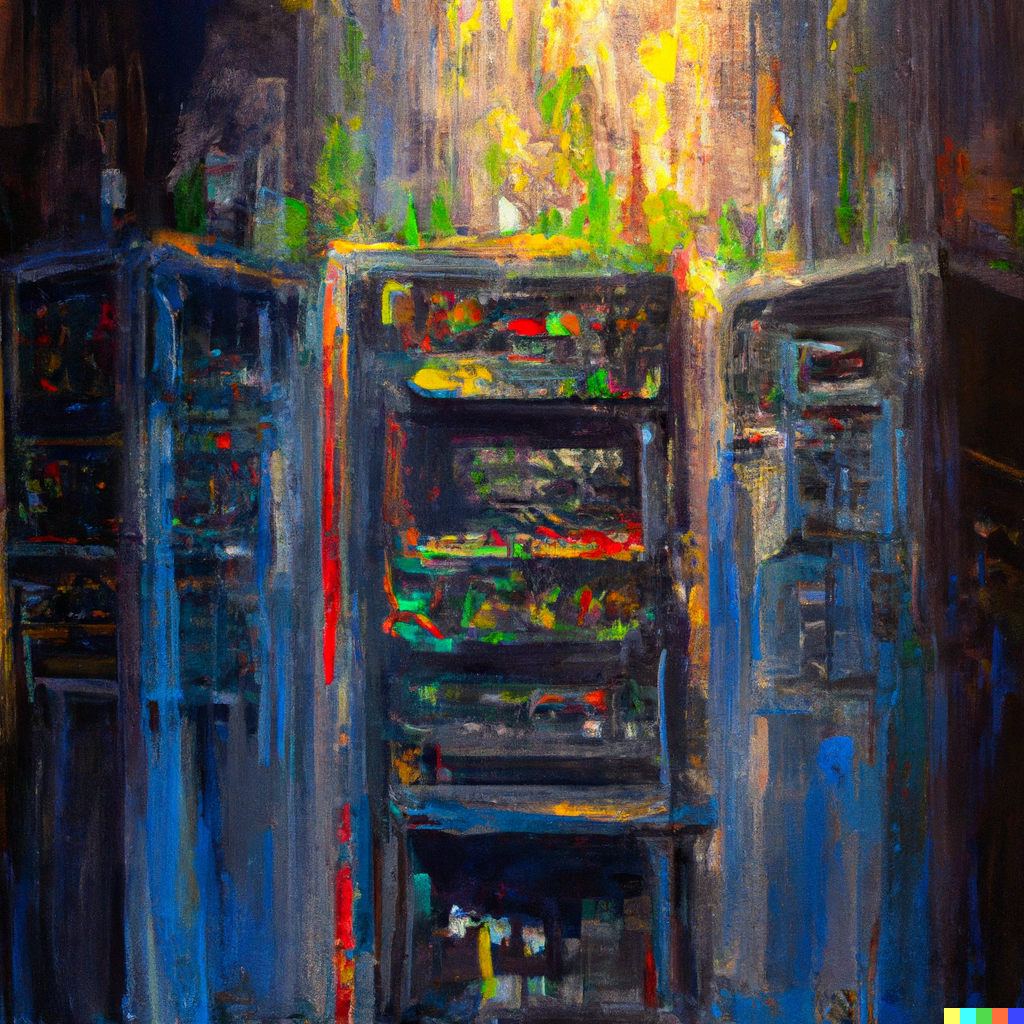
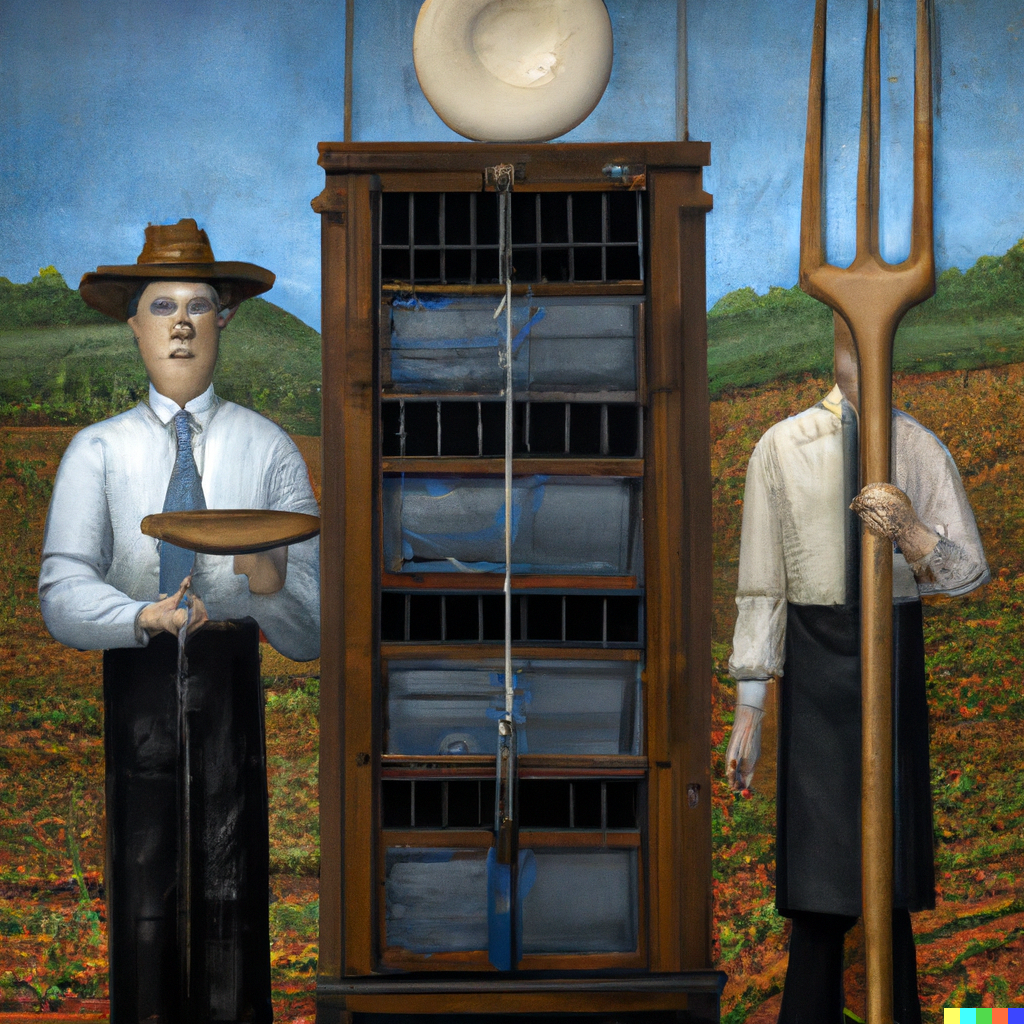
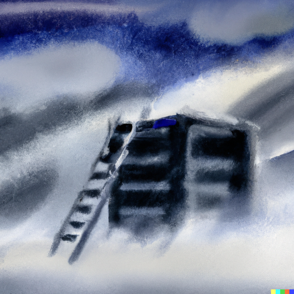
Let's first ask it to create something by its namesake, a data center by Salvador Dalí, as well as a computer server rack by the troubled artist (including cabinet as a word often confused it, bringing household furniture into the frame).
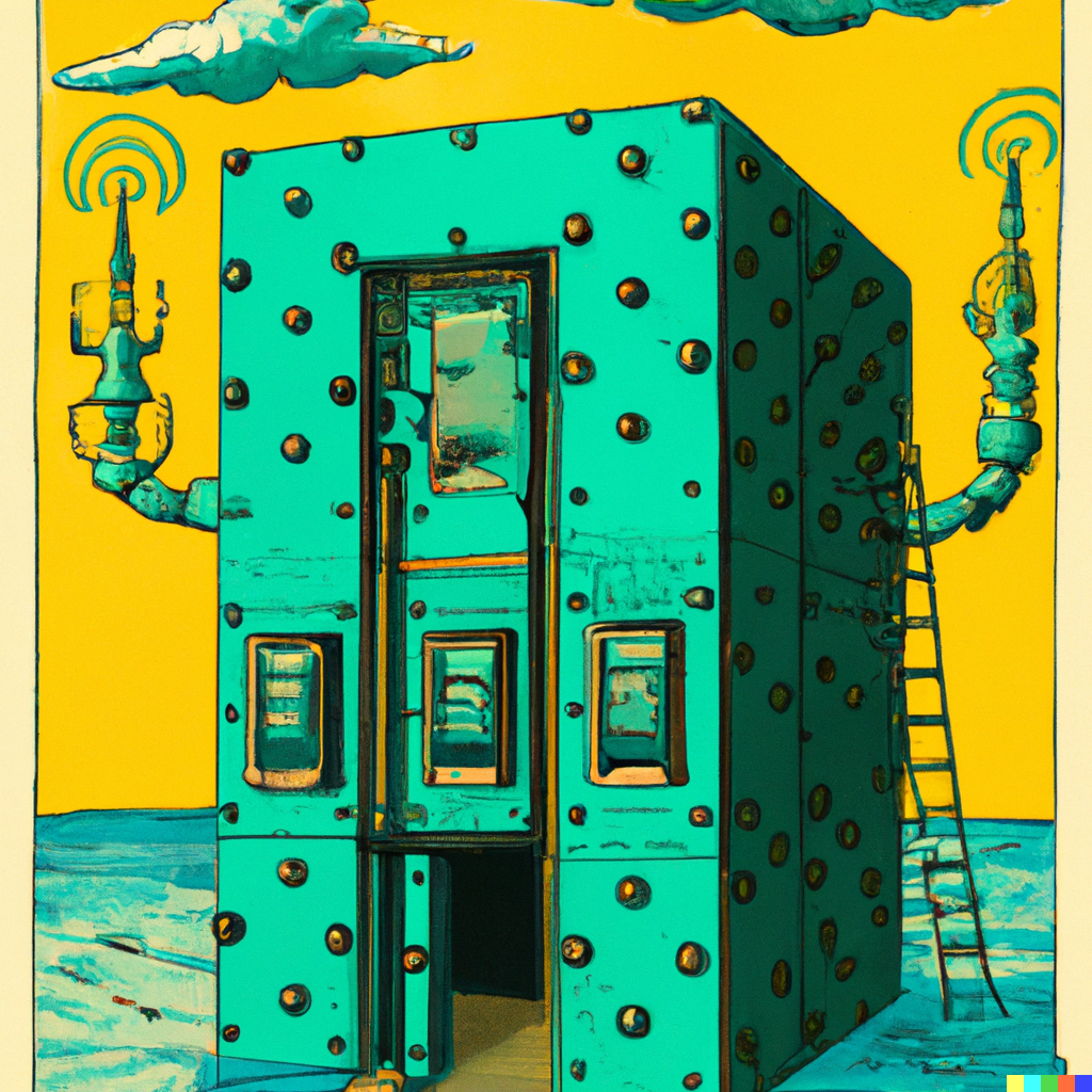
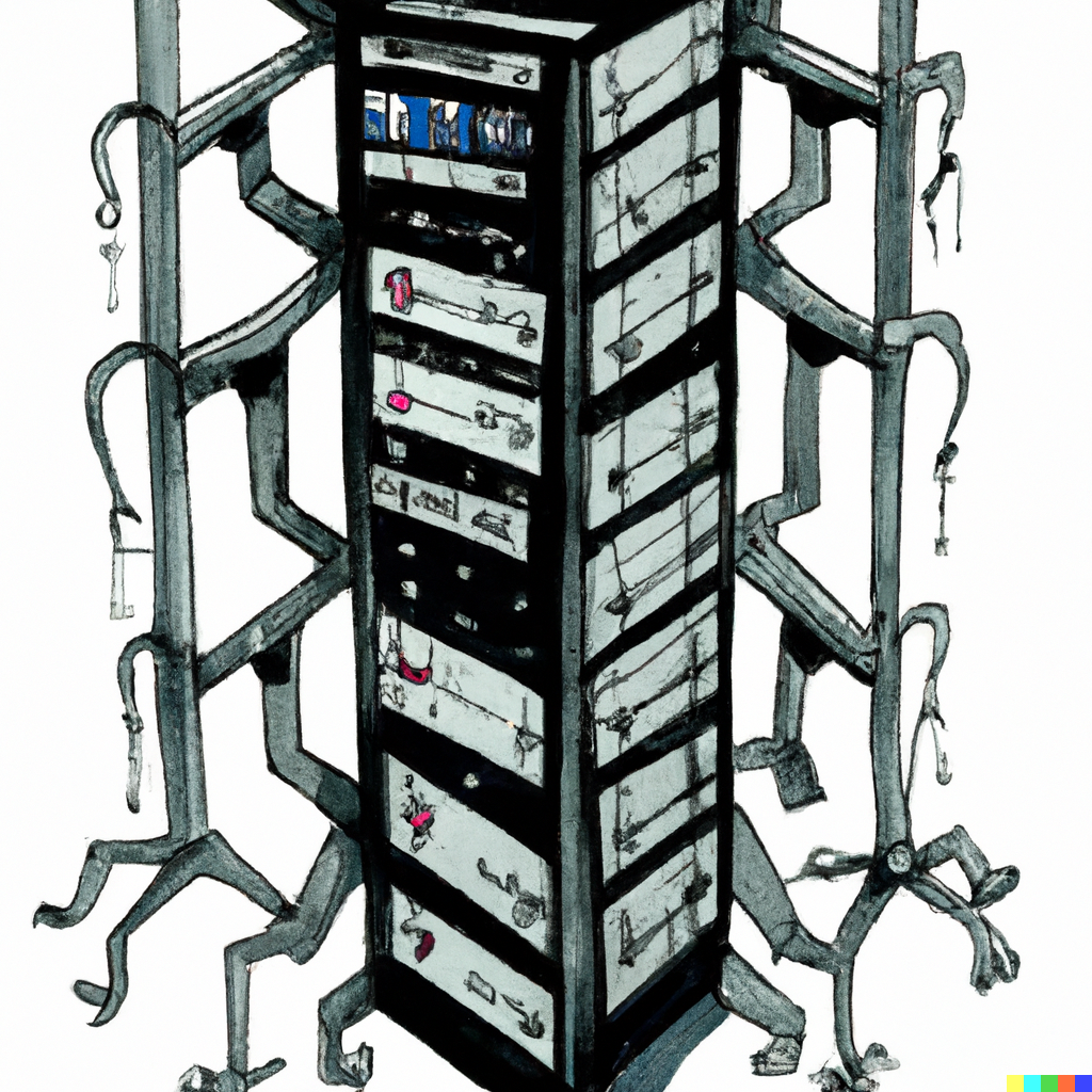

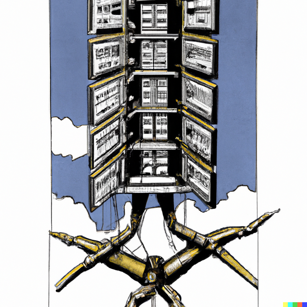
Here, the AI benefits from abstraction. Art can be more technically incorrect than photorealism, yet still great to look at. None of the racks look remotely real, but they do look fascinating in their surrealism.
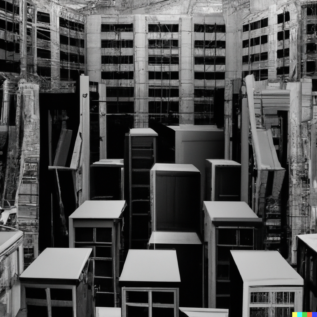
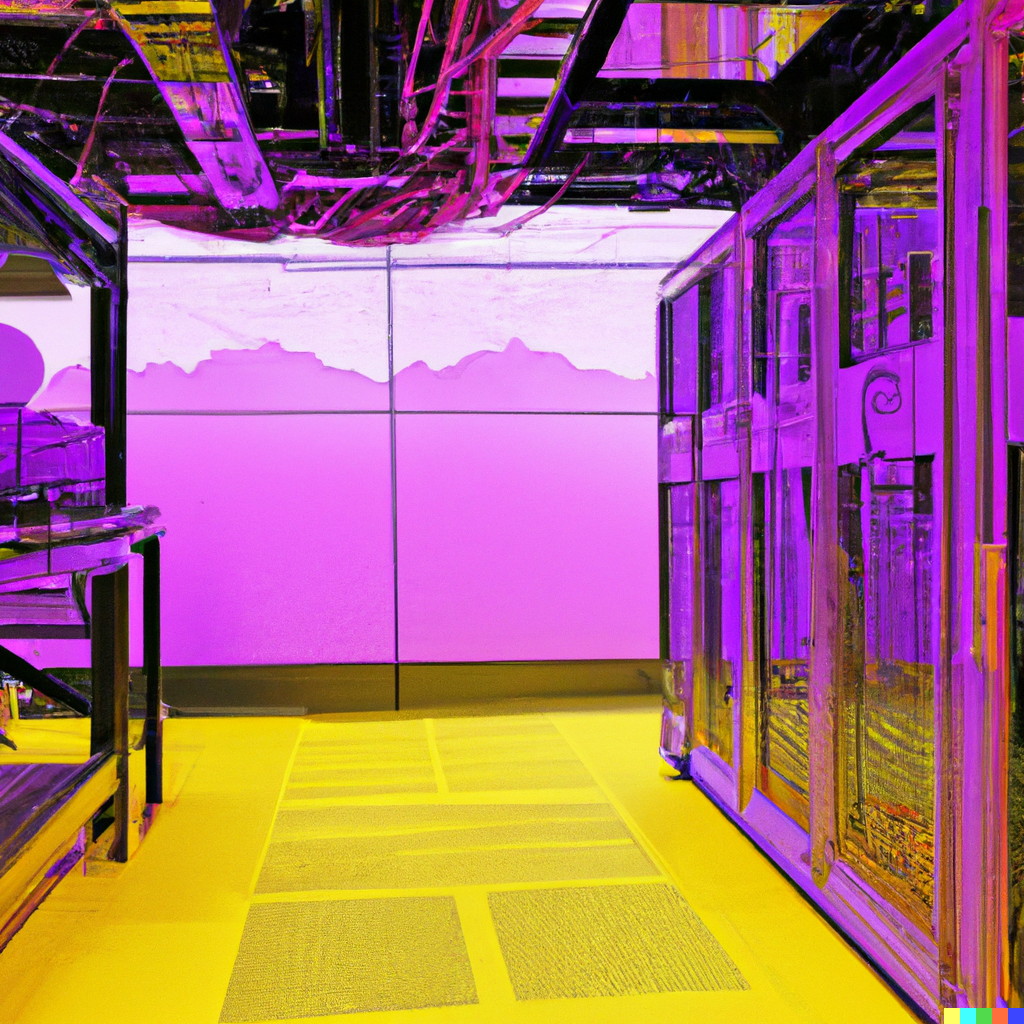
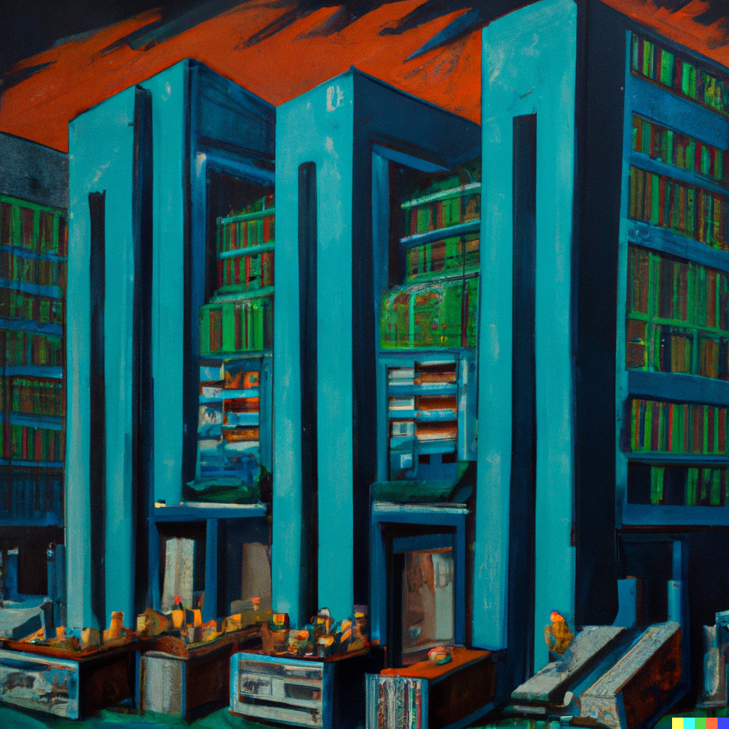
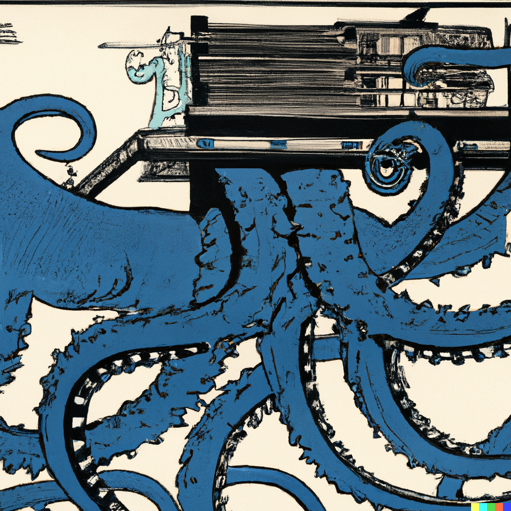
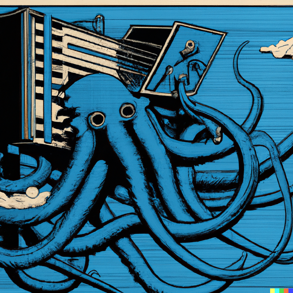
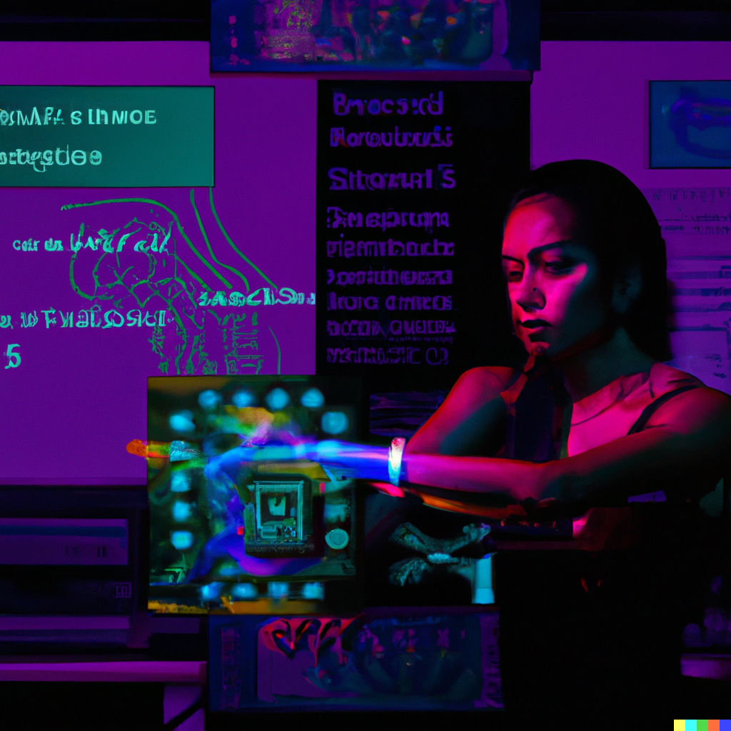
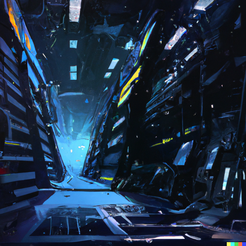
Let's try some other artists, with different prompts. In each case, I included the best images - many it created were terrible, or unintelligible - or had to tweak the wording multiple times and add different prompts to get it to work in a way that was satisfactory.


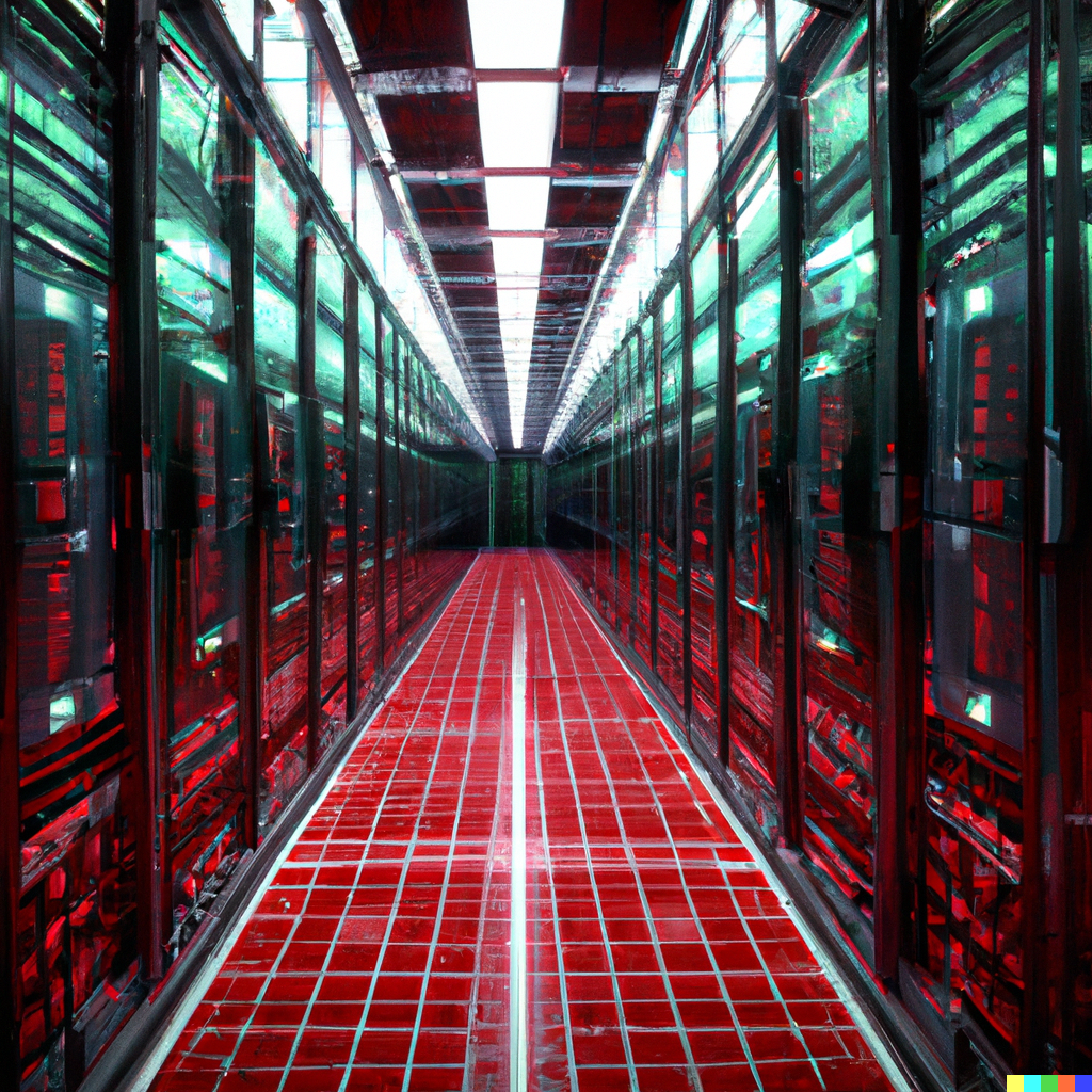

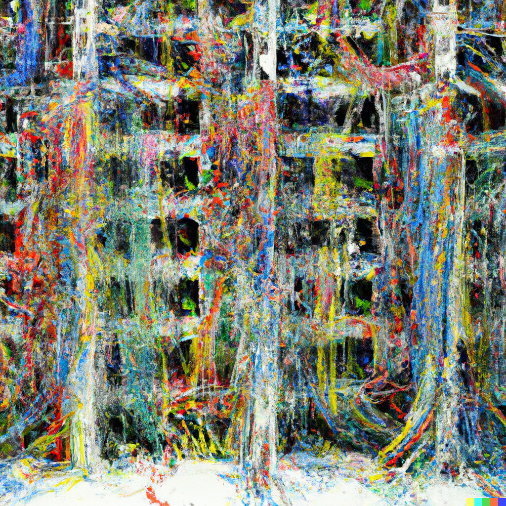


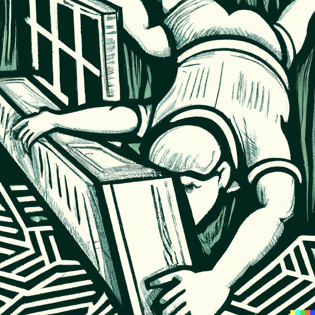
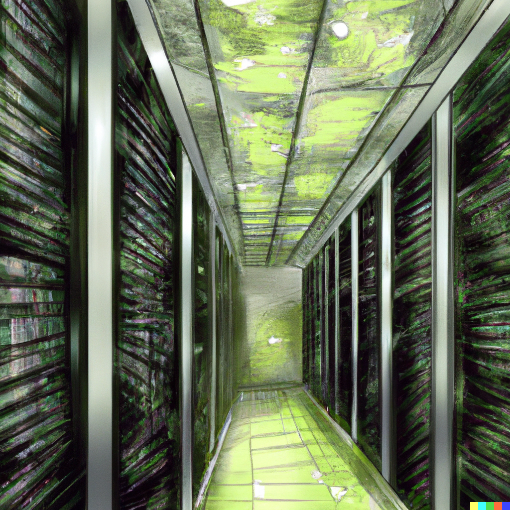
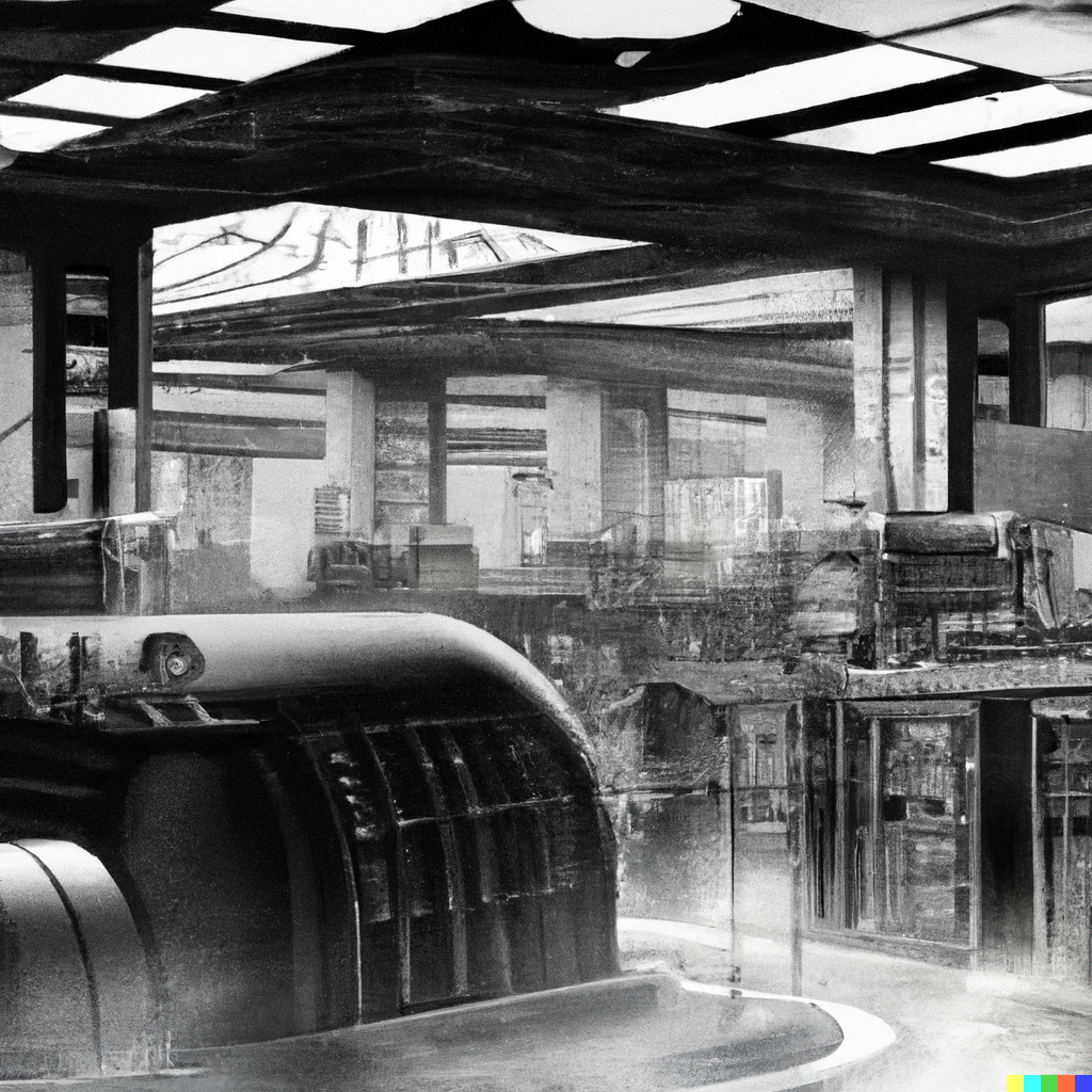
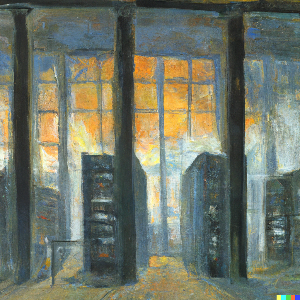


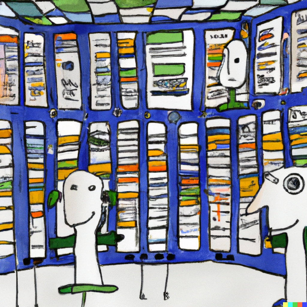
Wow.
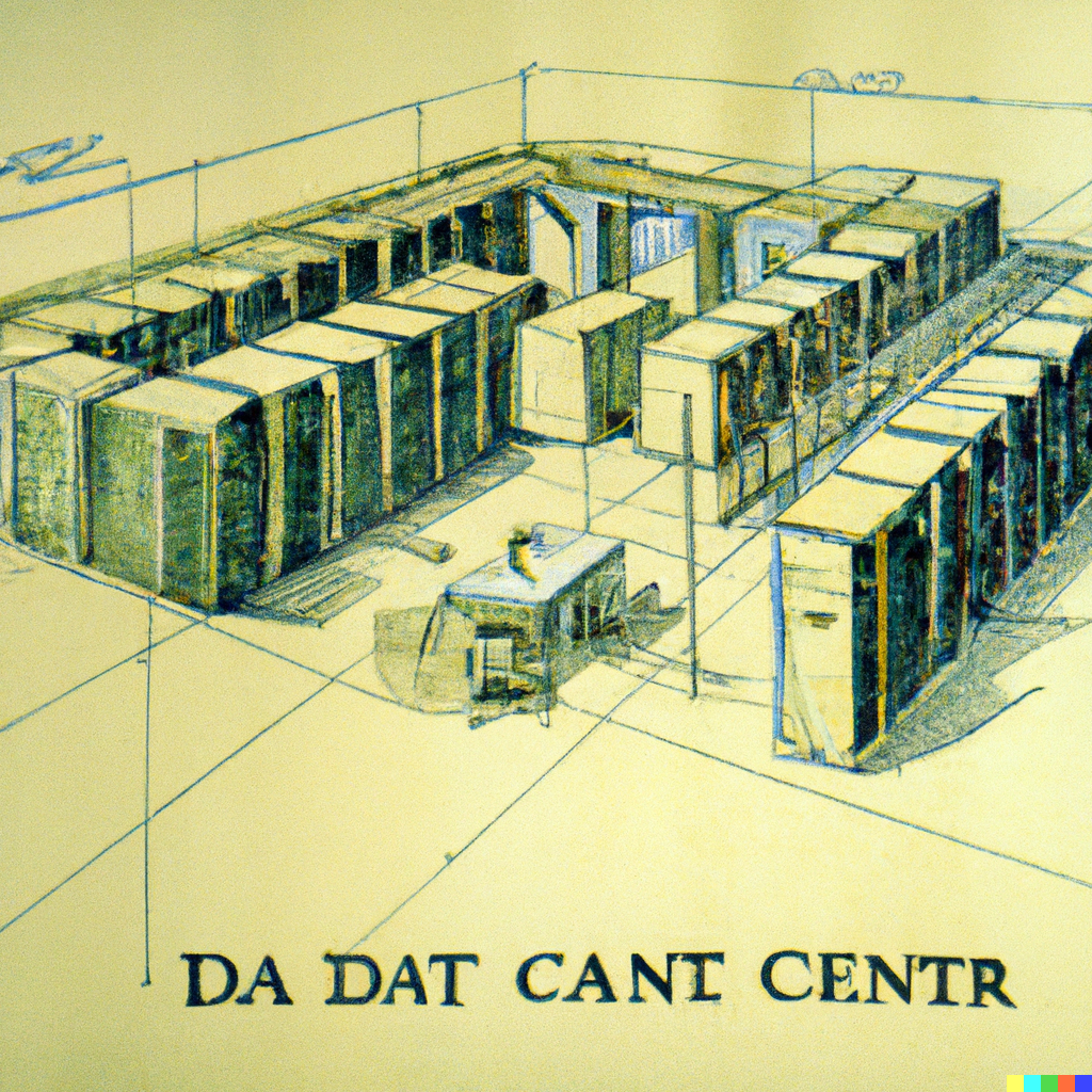
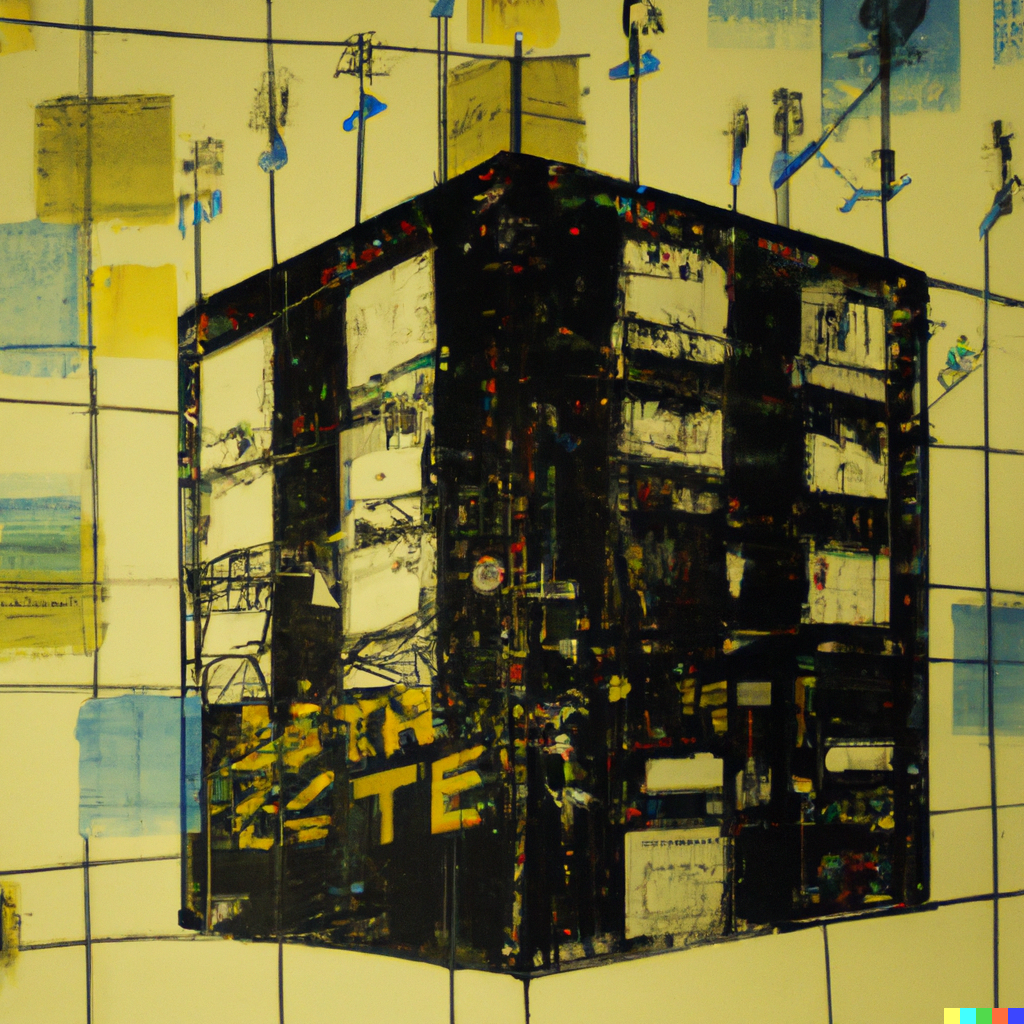
Again, it's important to note that some of these took a lot of back and forth - in particular, the system seems to have a propensity for writing "Data Center Cancer" across images... let's not read too much into that.
In many ways, working with DALL·E is like trying to work with someone that speaks another language, except that there are no translations or cross-language dictionaries. And the language keeps changing. It's a process of trial and error, that only sometimes results in success.
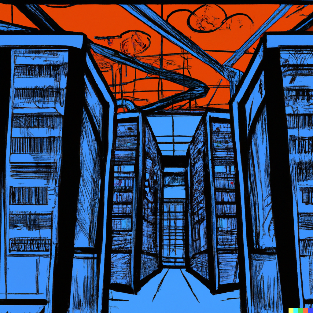
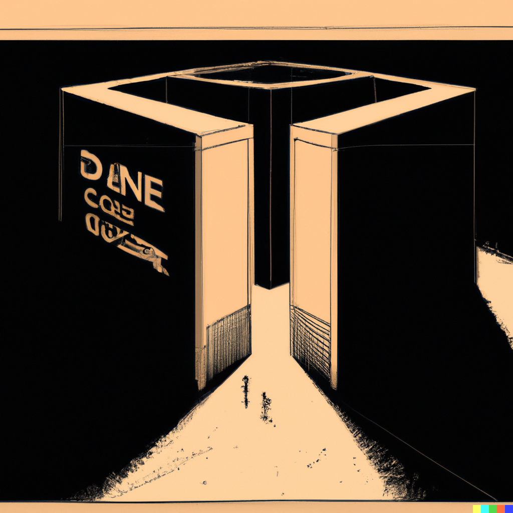
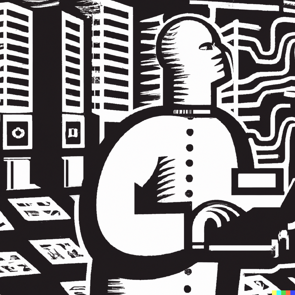
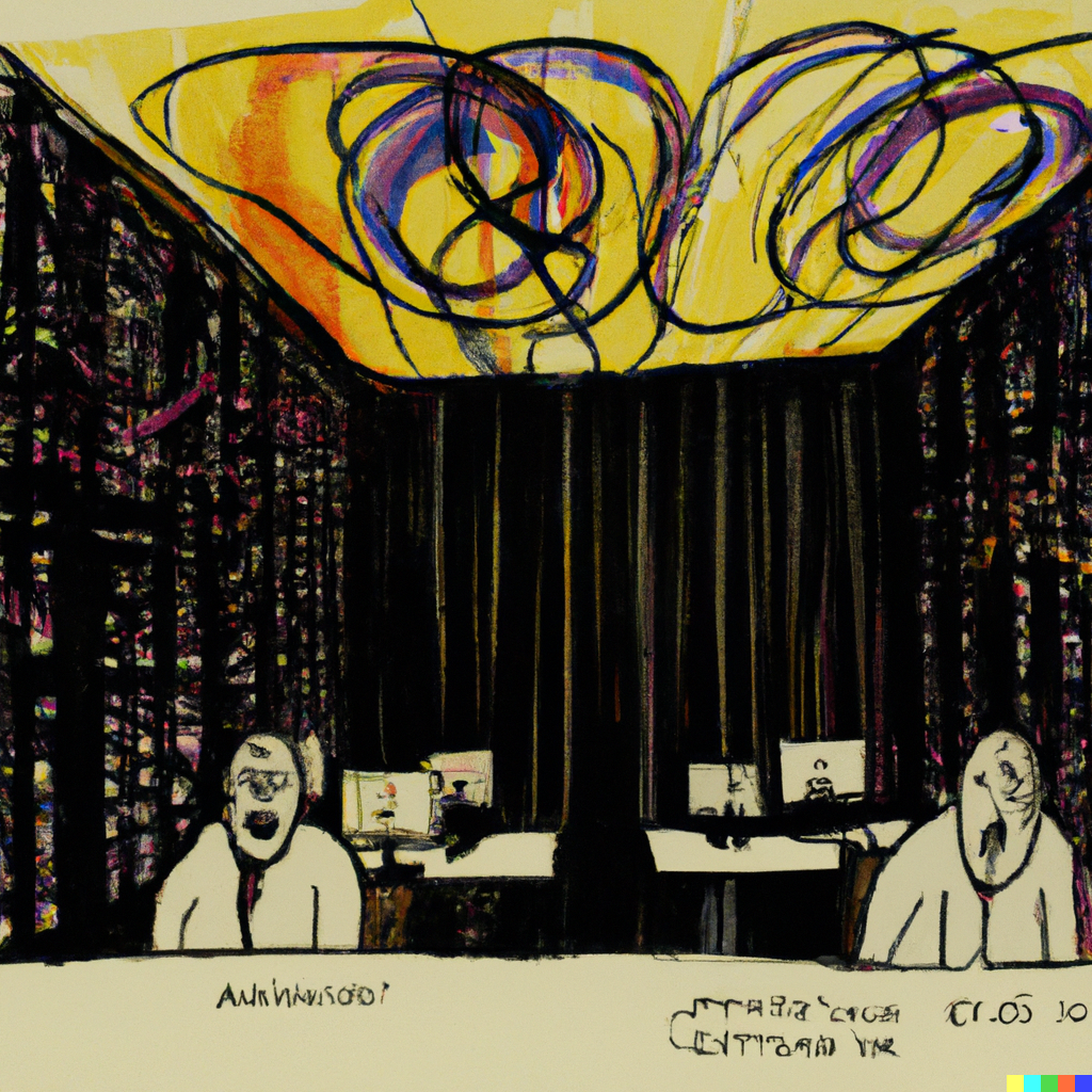
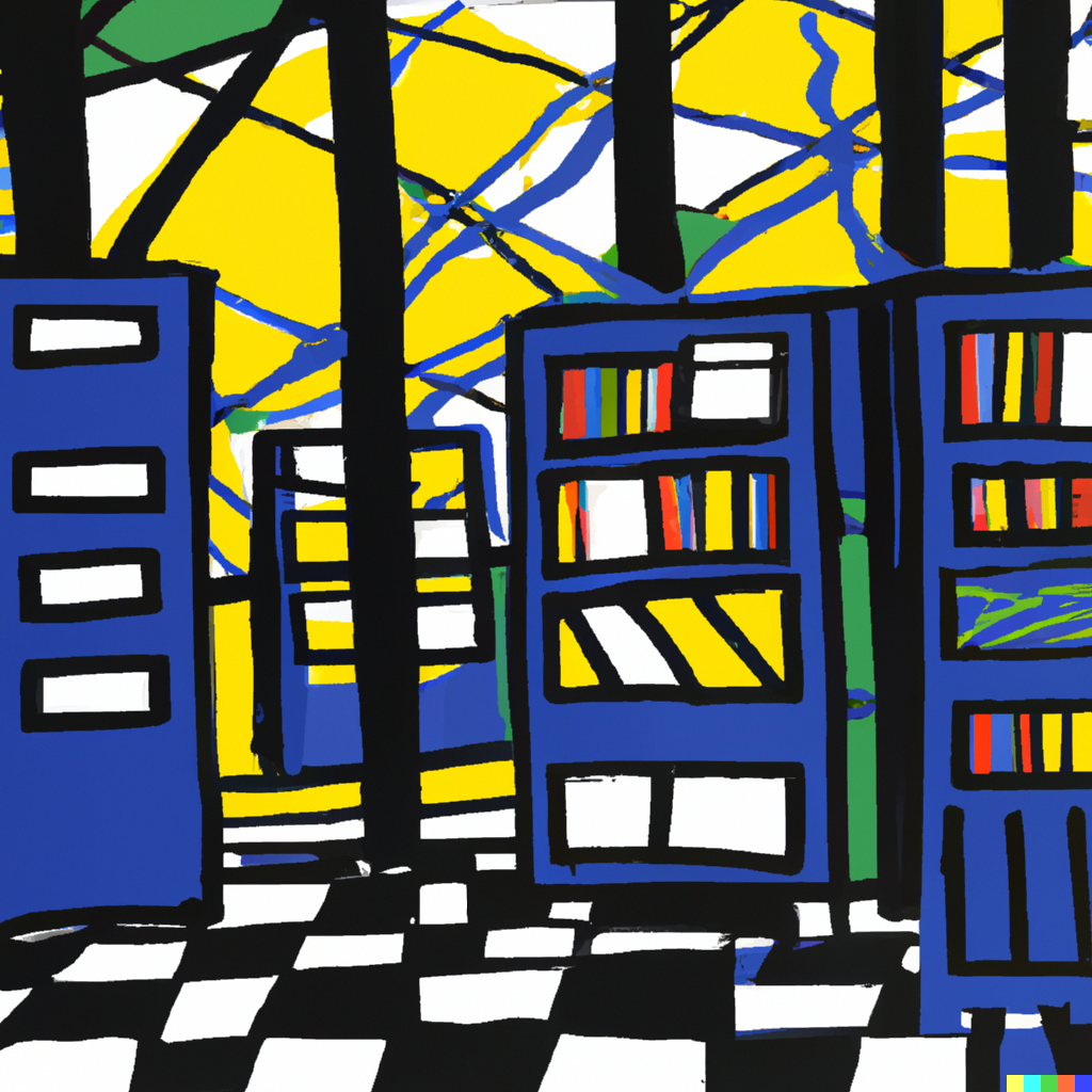
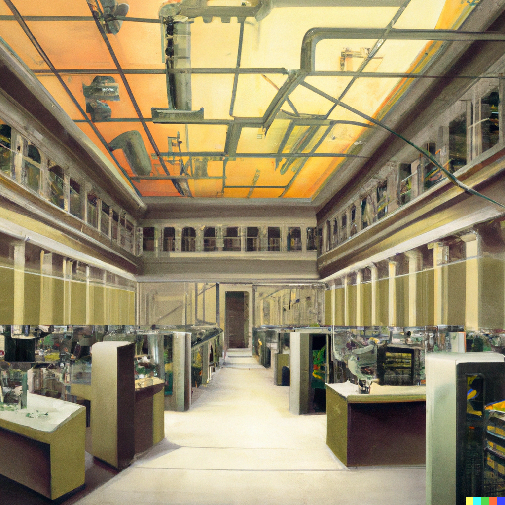
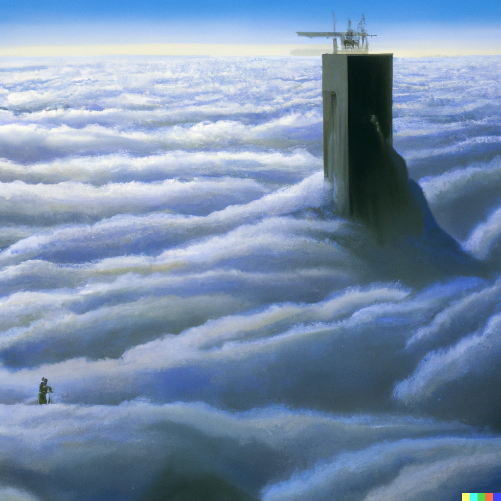
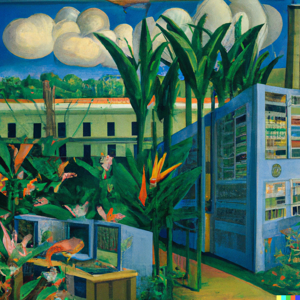
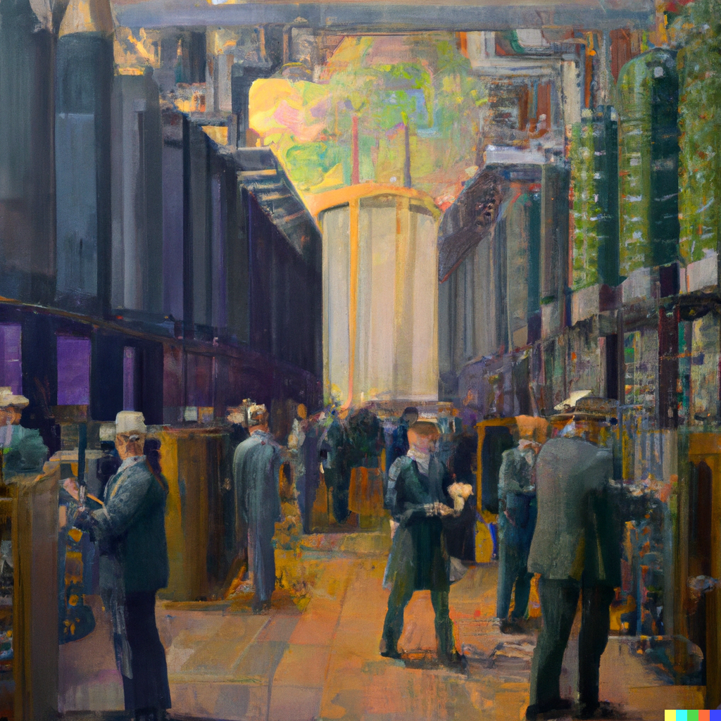
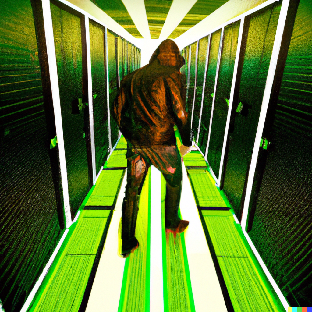
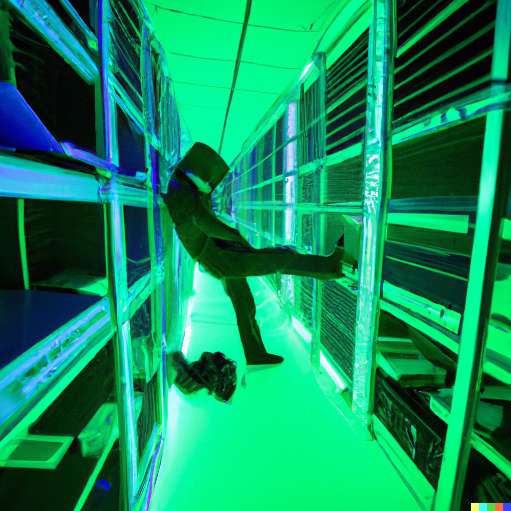
It's also a process that rewards inventiveness. OpenAI encourages coming up with crazy ideas that would be impossible in the real world. Again, I tried dozens of combinations, many of which did not work out. Here are a few that did (or at least were interesting enough to share):
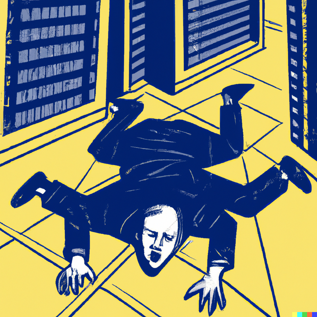


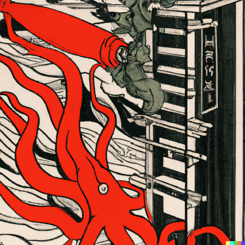
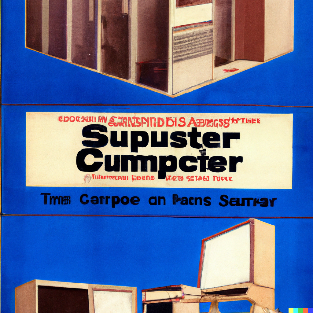
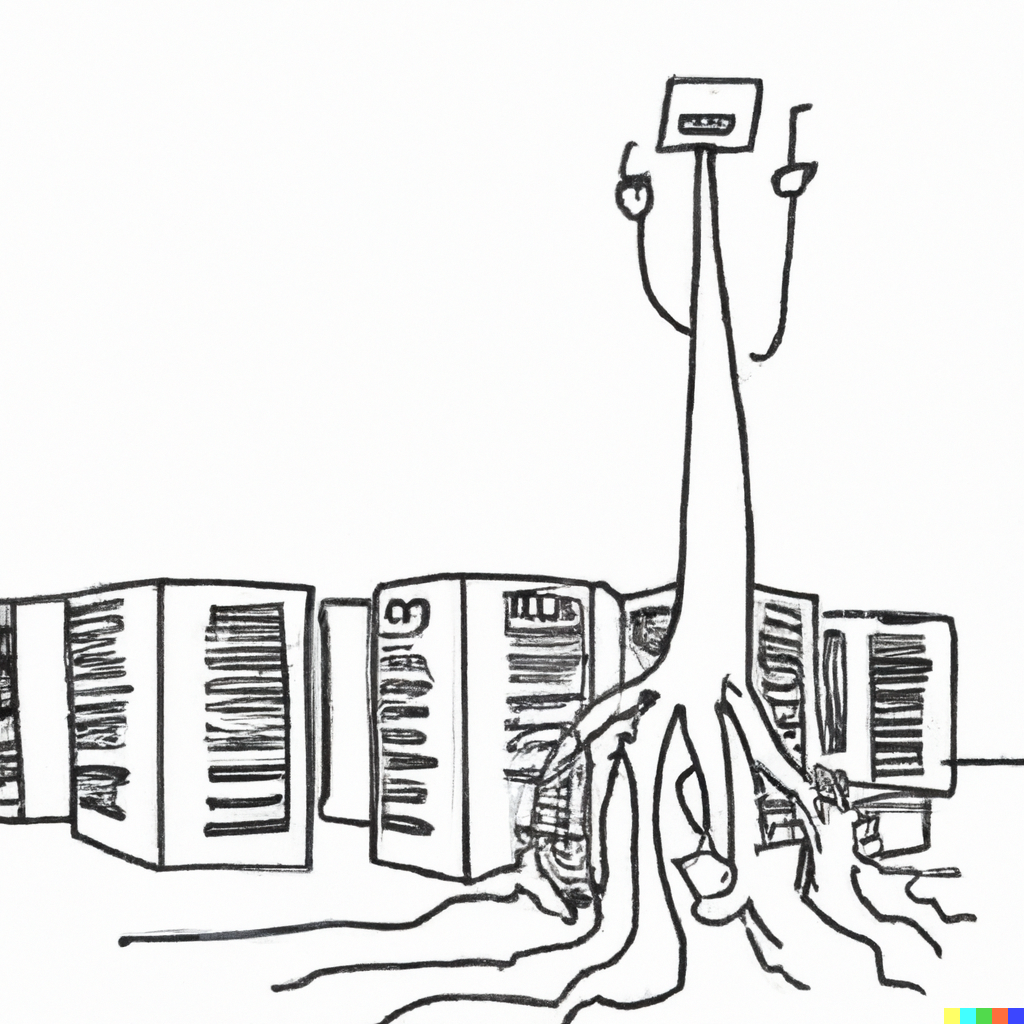
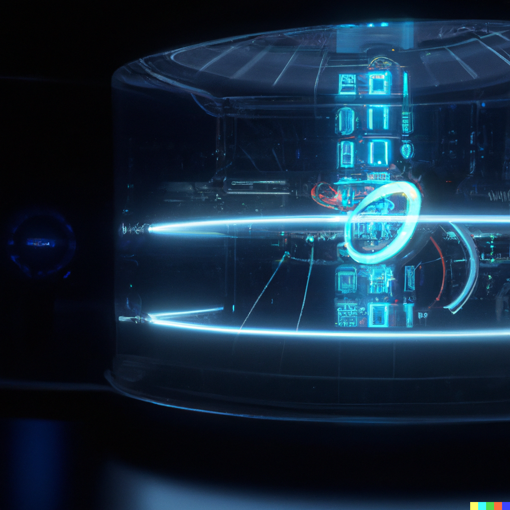
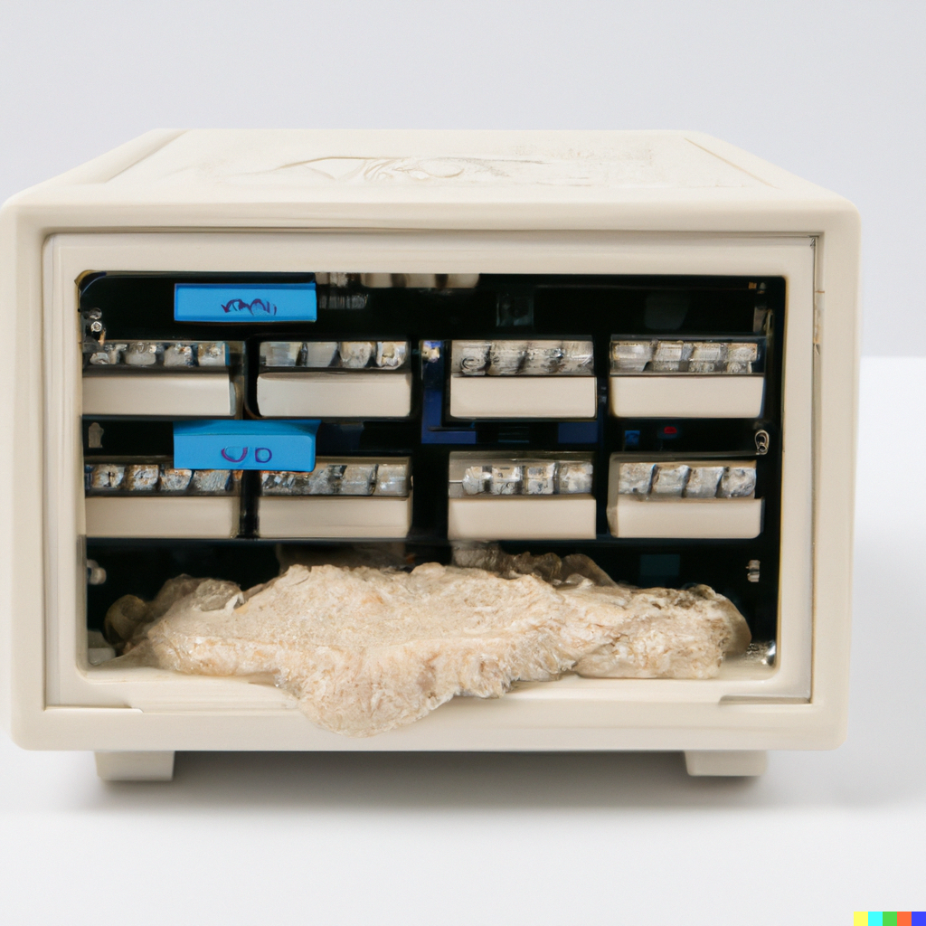
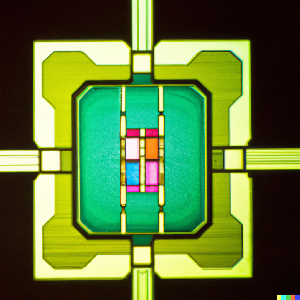


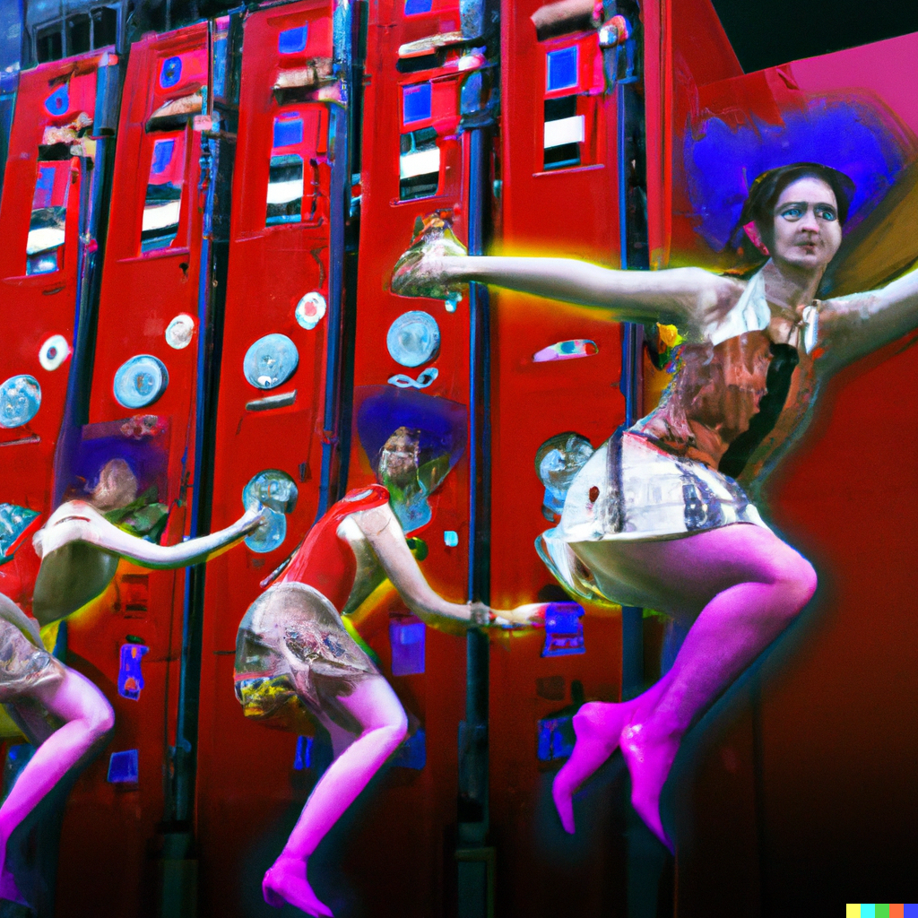
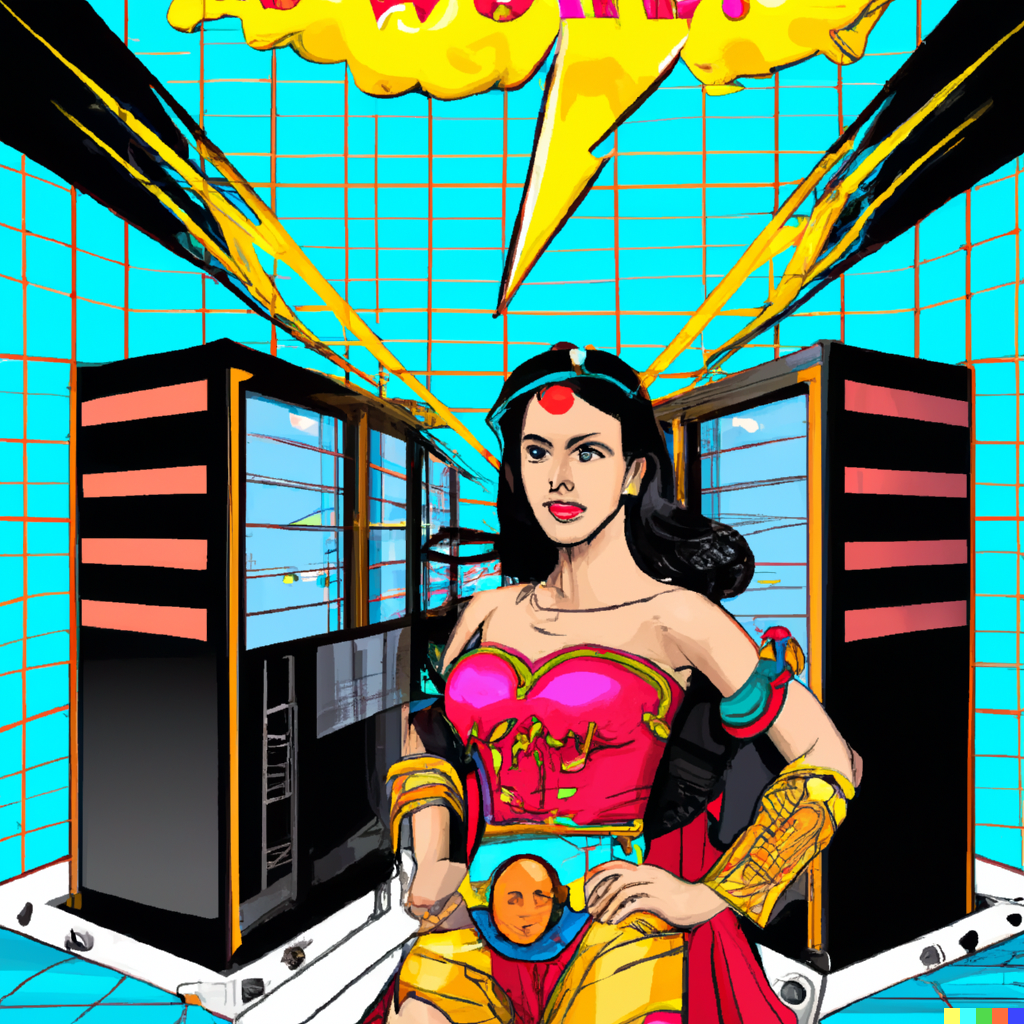
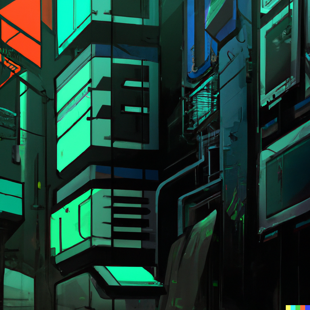
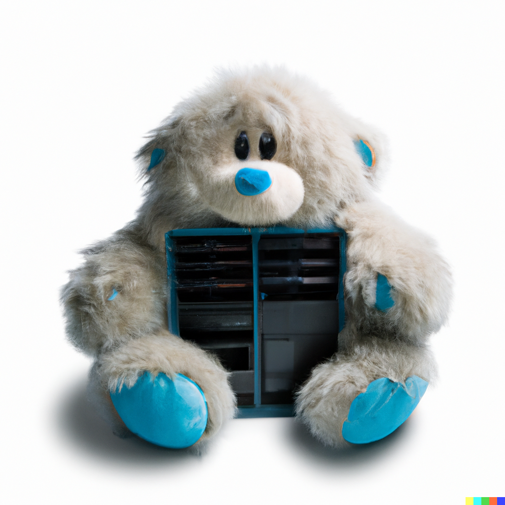
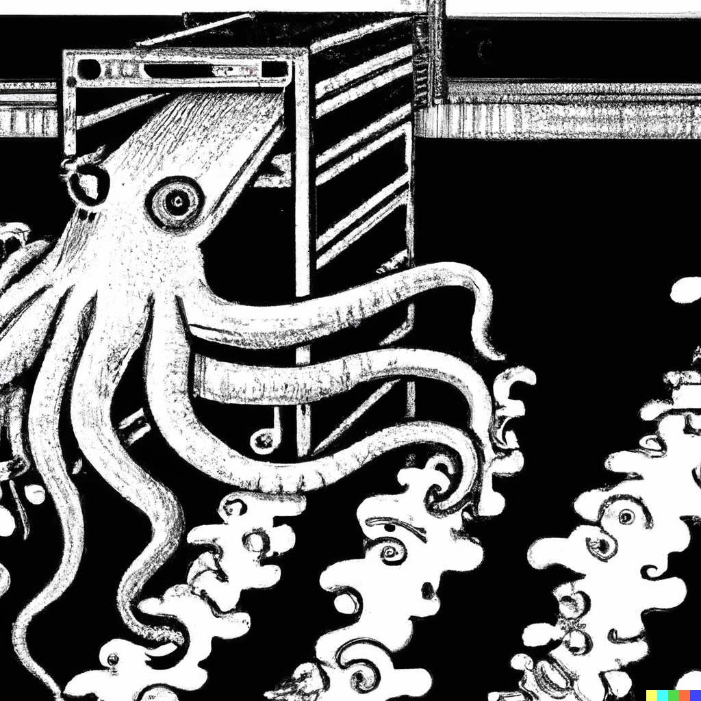

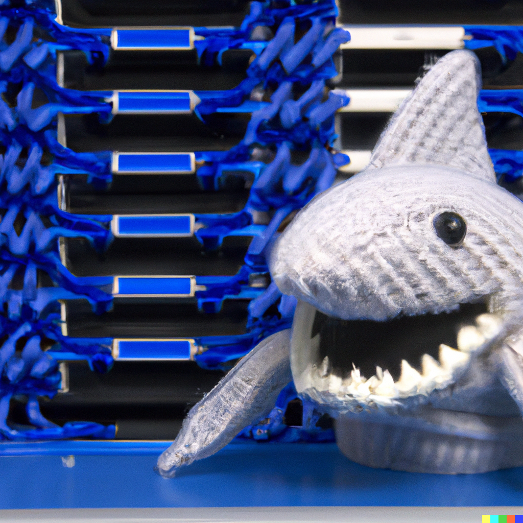
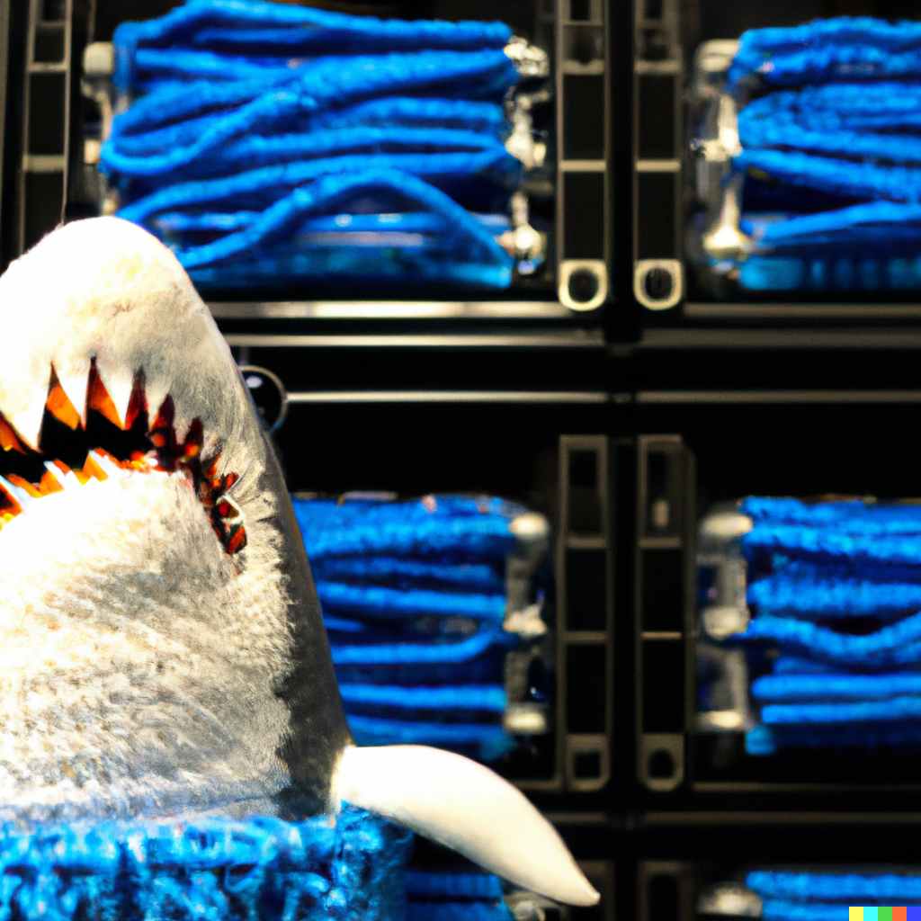
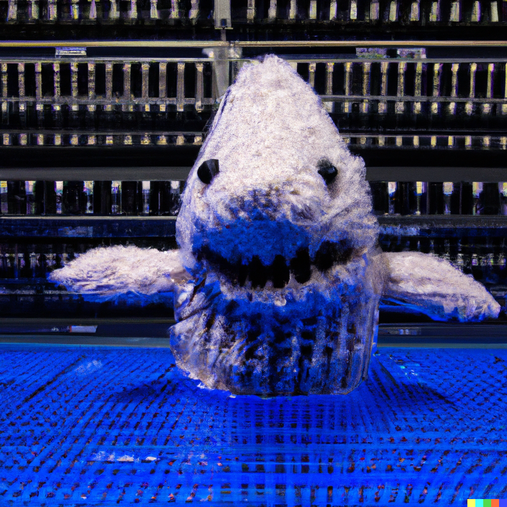

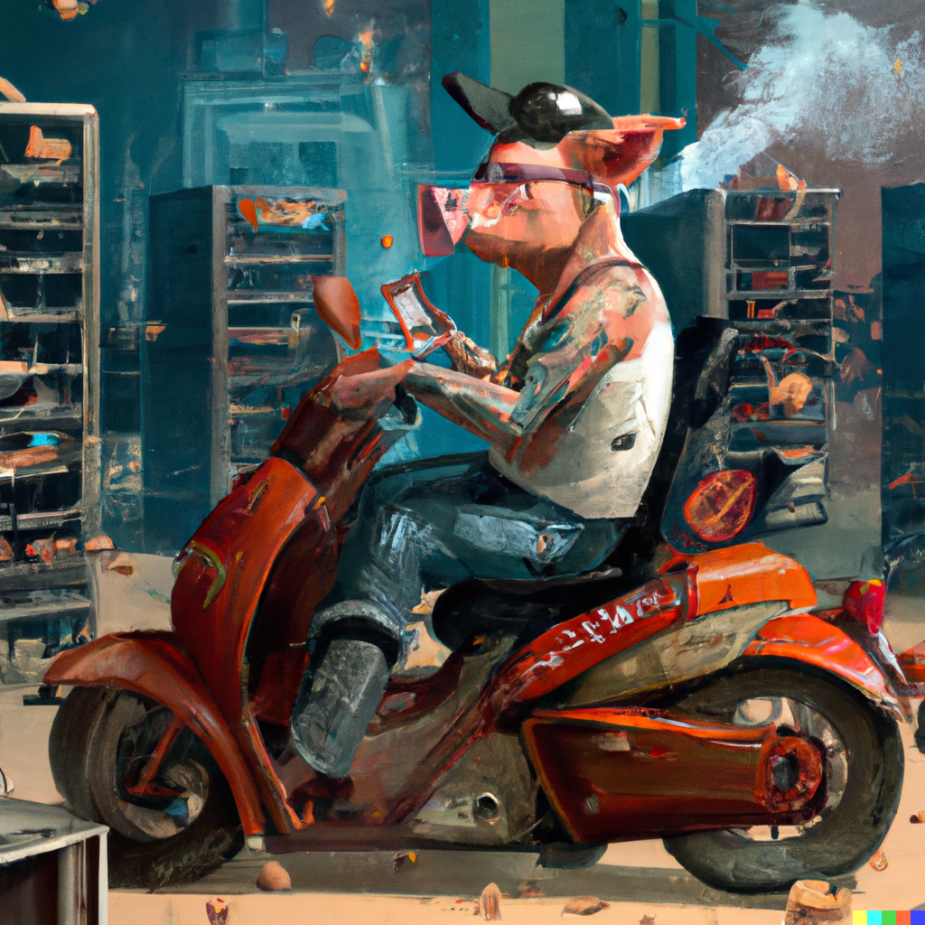

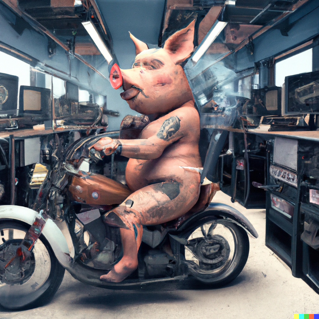
Again, some interesting - and often arresting - images. And lots of very strange ones.
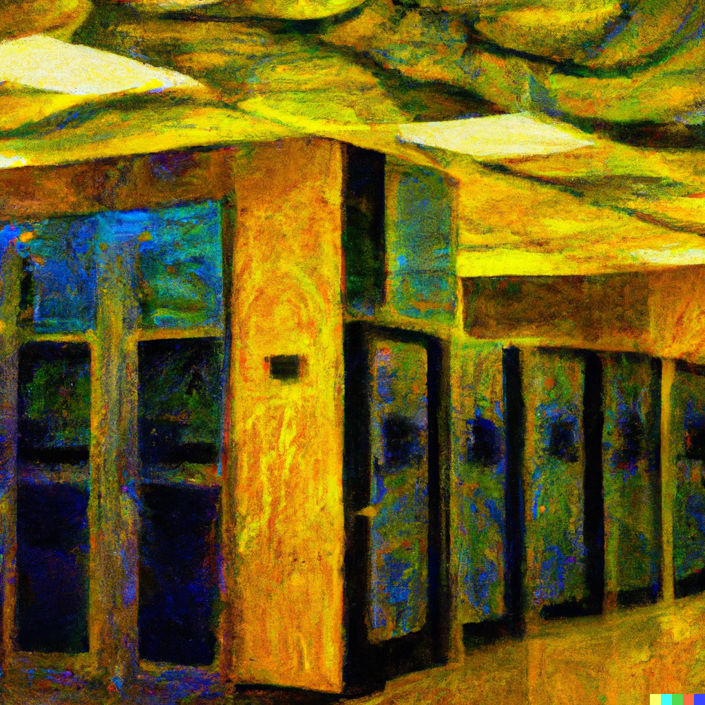
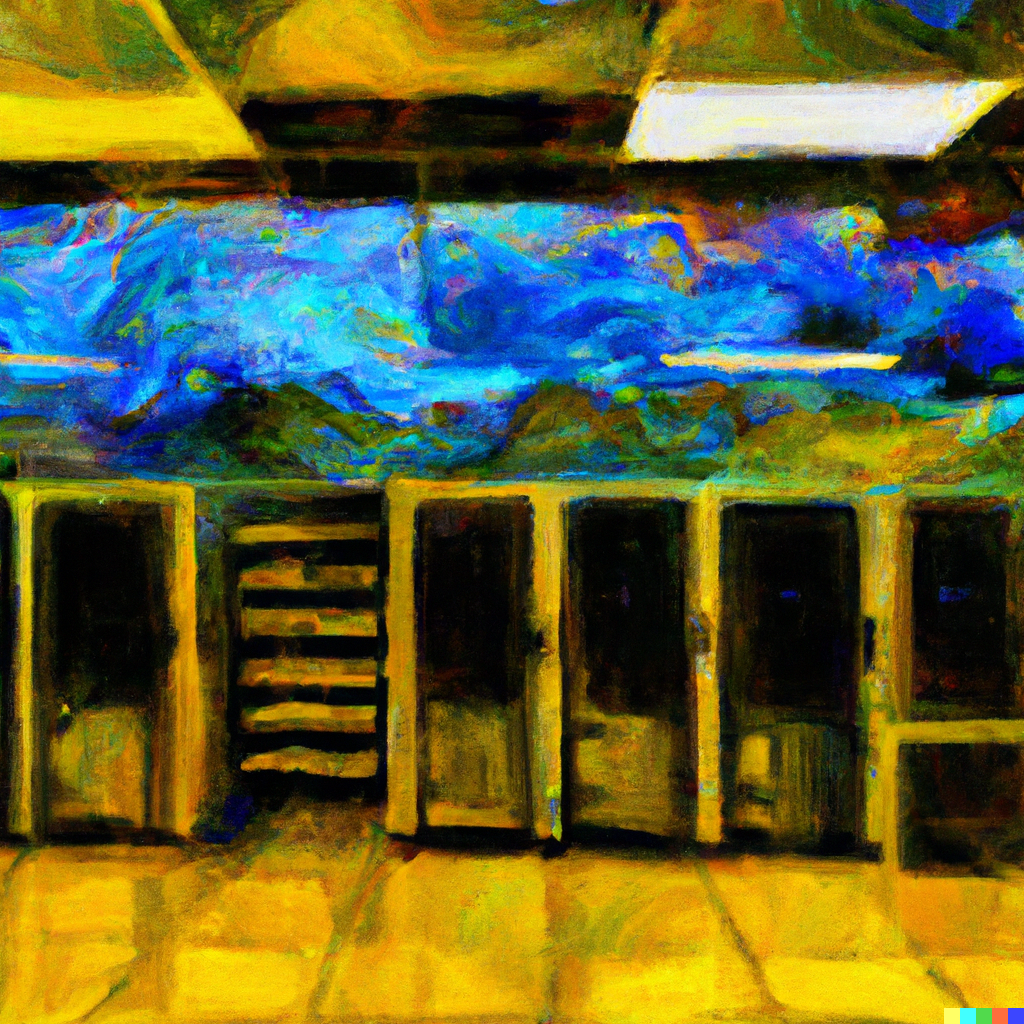
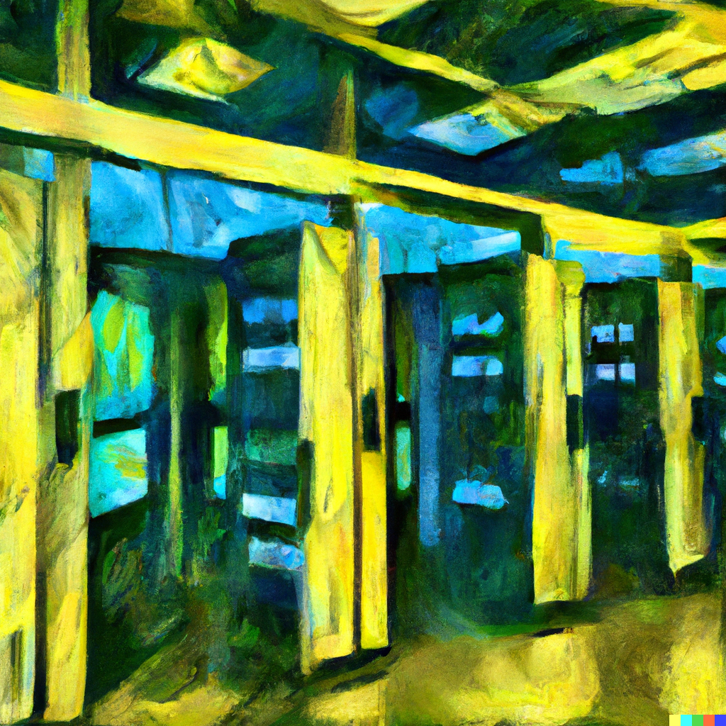
Still, DCD articles are, of course, about precise topics. Can it handle the demands of specific articles?
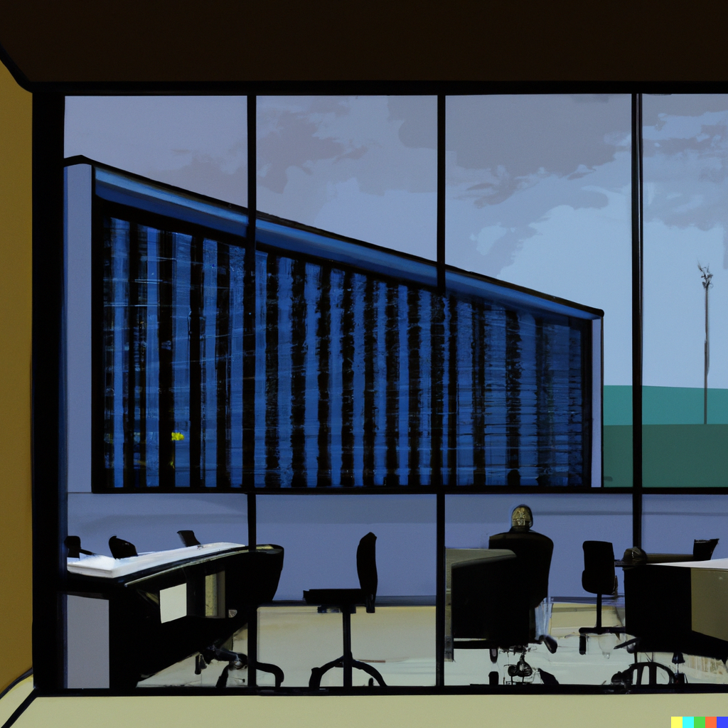
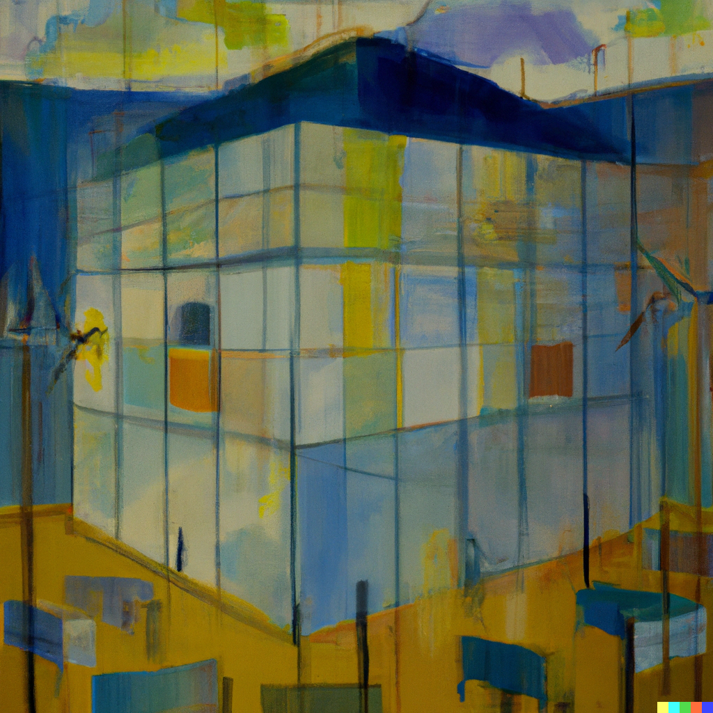
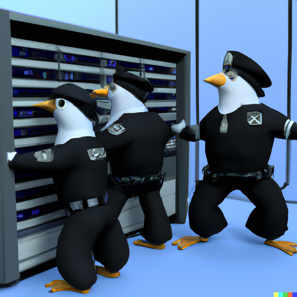
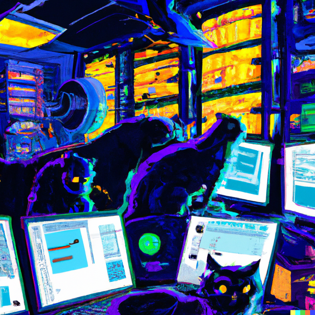
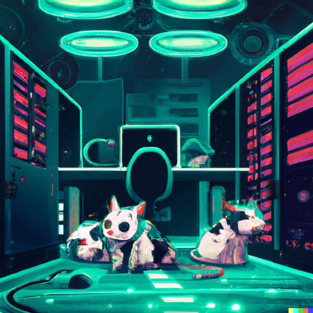
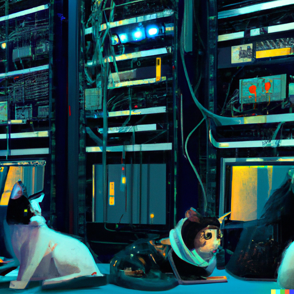
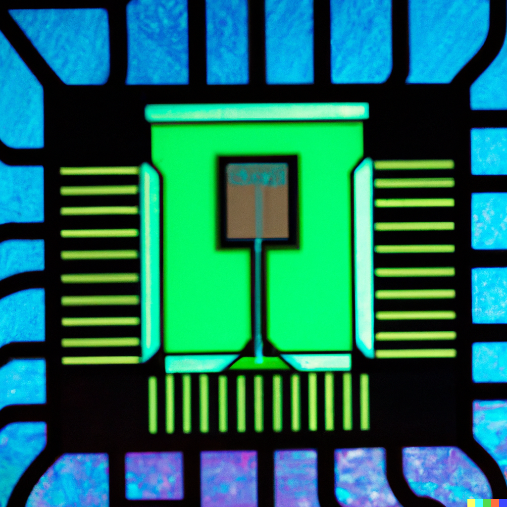
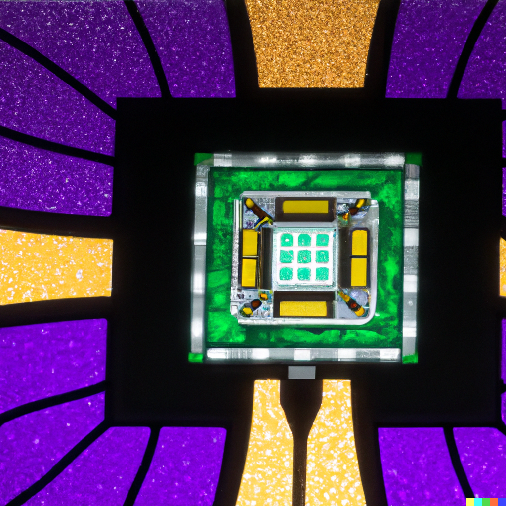
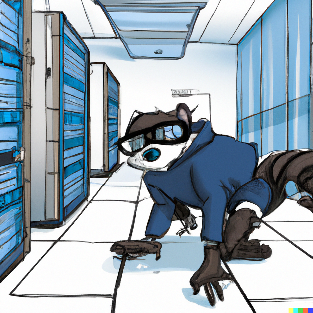
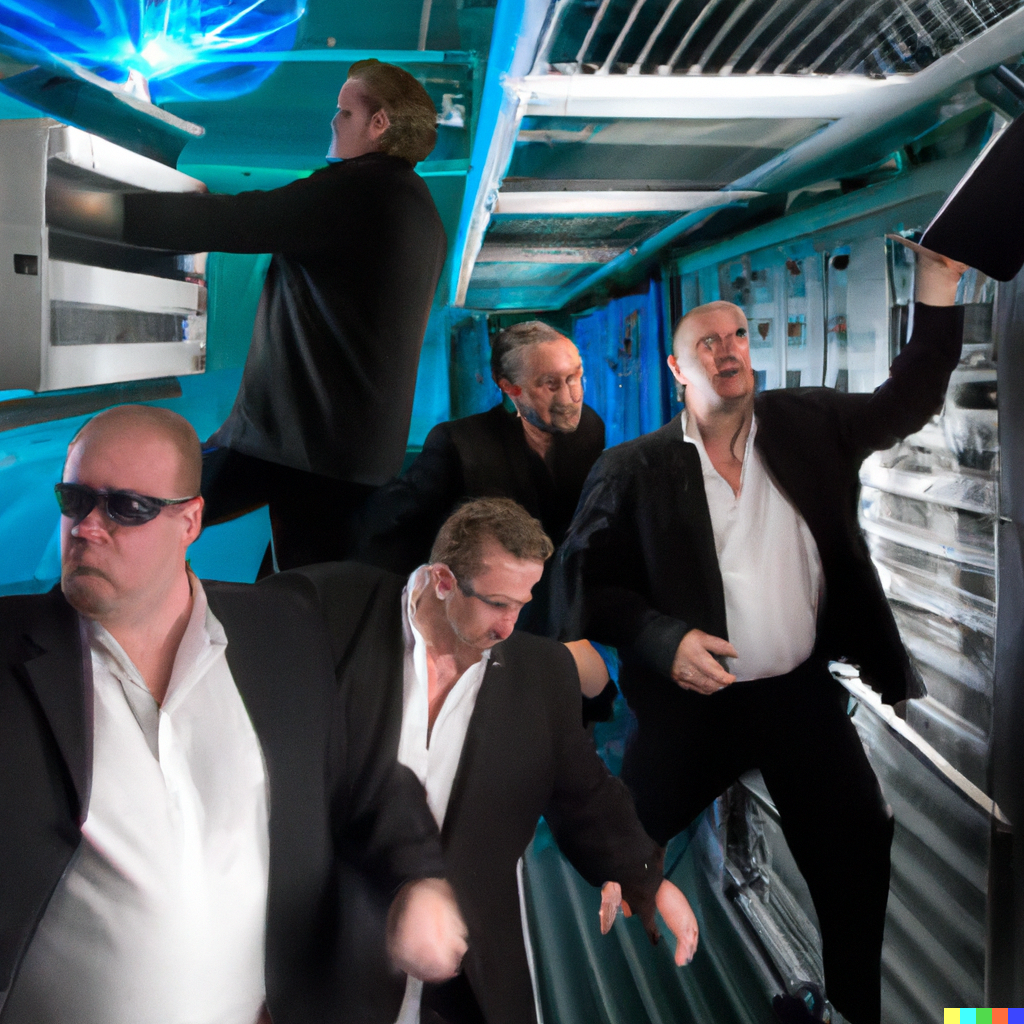
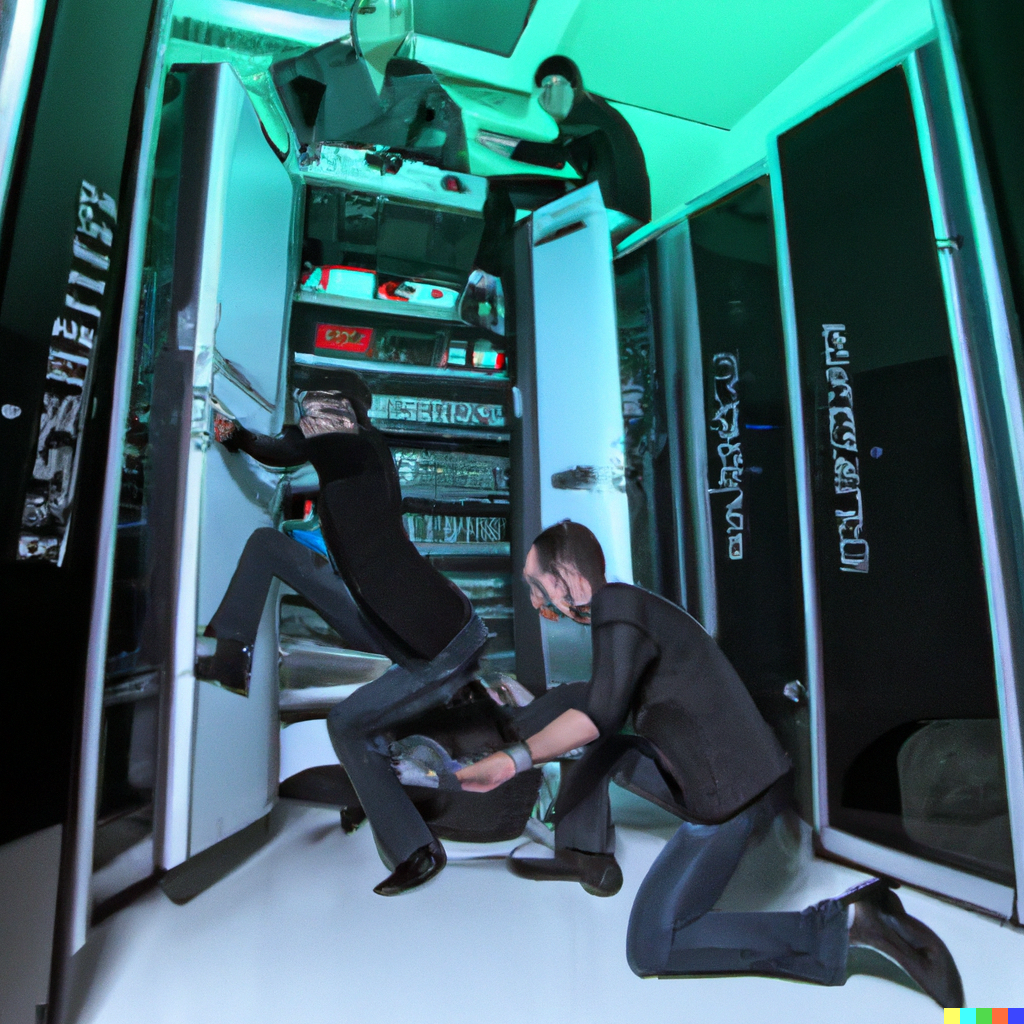
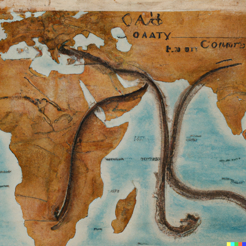
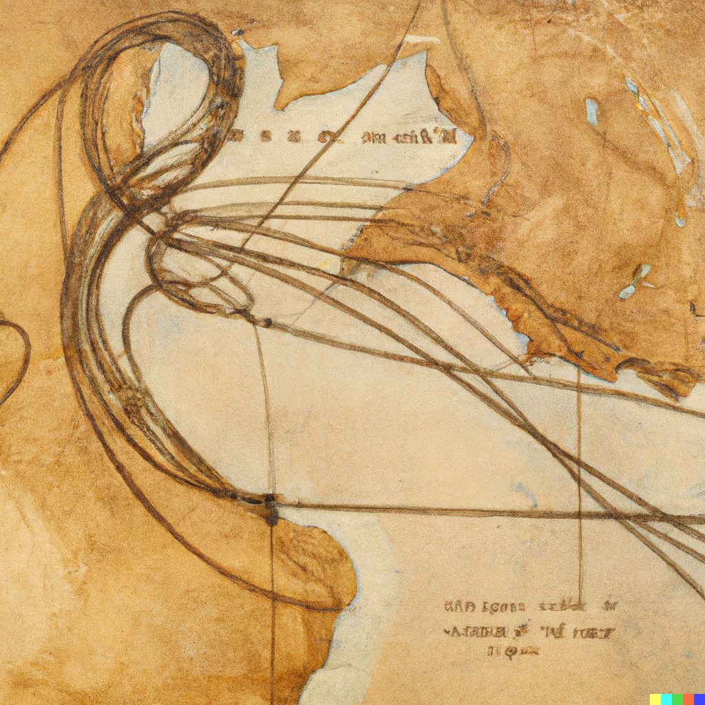
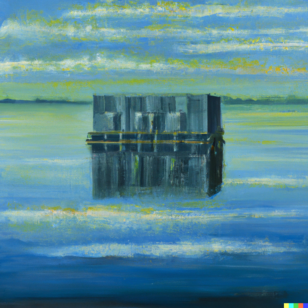
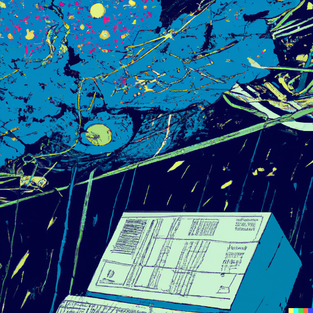
In the next issue of the DCD Magazine, we have a number of diverse features, including a profile of DigitalBridge's CEO Marc Ganzi, who is buying up the industry. We also have one on pen-testers breaking into data centers, another on the Egyptian submarine cable stranglehold. Elsewhere in the mag, we take a visit to a Nautilus floating barge data center, and another visit to a supercomputer studying dark matter. I also included pictures of common topics we cover.


(At this point, our CMS stopped letting me add more images to this article. The remaining ones are linked here: 1, 2, 3, 4, 5, 6, 7, 8, 9, 10, 11, 12, 13, 14, 15, 16, 17, 18, 19, 20)
Hmm. Again, there's a selection bias, because I am choosing the better images, but many here are not of the caliber required to be in the magazine. Faces are too weird, locations are incorrect, and details fall apart under scrutiny.
Perhaps a different selection of inputs would have worked, but it's impossible to know, without spending more time and money iterating - and, as you can see, there are immeasurable inputs and styles one could try.
I also decided against using it for more sensitive features, such as our coverage of Ukraine - and the system tries to block mature or abusive images, for obvious reasons.#
Resolution required
Another issue is that the images are not in a high enough resolution for a magazine - but again AI can help. I simply used an AI upscaler to increase the resolution of some of the images and fill in the gaps, and in my trials it worked remarkably well.
So, we return to our long-drawn-out question - could this illustrate the mag? The answer is rather anticlimactic: Sometimes.
Some stories are made better with real photographs - with my visit to Nautilus, the photographs help show what the facility looks like, providing additional details alongside the copy. Some stories are more photojournalism than text.
Similarly, a feature about a new development benefits from images of the actual site. Interviews are often best illustrated with photographs of the subject. And anything involving a corporate logo requires care to avoid angry lawyers.
Plus, as much as I complained about the visuals of data centers at the beginning, I must admit I am partial to some of them - and we should always be highlighting interesting, real projects.
Equally, difficult and sensitive topics need to be handled carefully, by illustrators and editors that can understand context. We also can't rely solely on a system that won't create certain images that its filters block, especially as the filter often stops harmless images incorrectly.
Then there are the many cases where we just can't get it to create the images we want. I cannot stress this enough, I rejected many thousands of terrible images for this piece. This problem will likely decrease both as the AI improves, and as DCD's ability to understand how to talk to it gets better, but there will always be a level of imprecision that doesn't work for every feature.
There are also practical issues - a multi-page magazine feature will require multiple similar, but distinct, illustrations. The system often struggles with this.
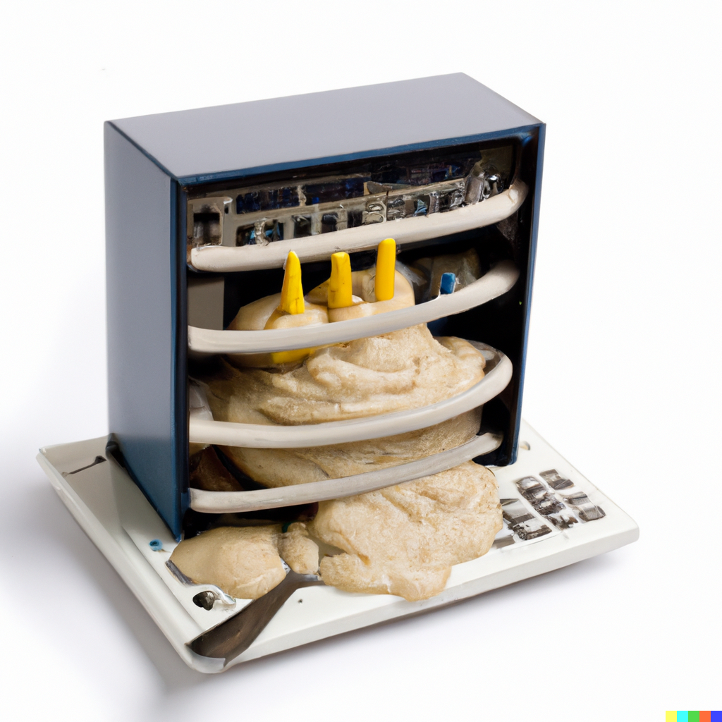
We should also be careful not to get too excited about the ‘shiny new thing,’ using it simply because it is cool and different. What we use needs to stand the test of time. Attempts to make images of servers made out of play-doh looked naff, whereas our designers made some in the real world that I think look great.
But that said, I can envision using some of these images in the magazine or on our website. In the next issue, we will feature some of these upscaled in a dedicated section, as well as new creations - if you have any suggestions or requests, let me know.
What about the human side?
However, we will always be very careful to highlight what these images are and not pretend they are real, or the works of humans. Where our designers use DALL-E in tandem with human work, we will also make sure we clarify. It is here I see the most use, taking advantage of both AI and human working together - either for a final product, or for storyboarding ideas.
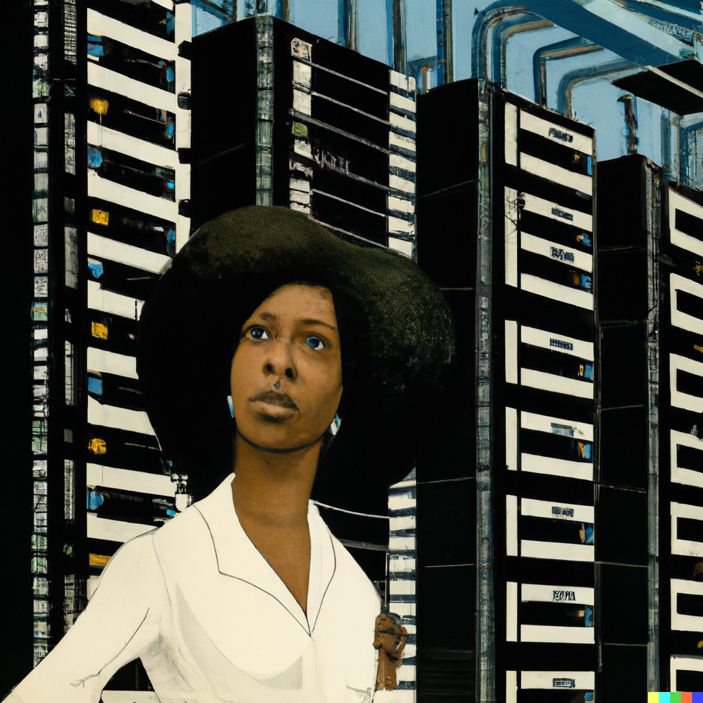
Then there's the matter of AI bias - AI echoes back the data it is fed. Given that, I was pleasantly surprised to see requests for data center workers produced a diverse array of people, albeit with often inhuman faces. This reflects the dynamics of the industry: The photographs that companies take and share of their workers are often more diverse than the reality.
We will have to bear all this in mind as we approach this new frontier carefully. We will only use it when it augments our coverage, not as a replacement for useful images and human-made artwork just because it is easier.
It can be hard to accept change, especially one that lowers the barriers to entry for others - but we should use the tool when it serves our content and our audience, it’s as simple as that.
Artists and creators are also concerned about what it means for their industry, and rightfully so. But part of me can't help but see the poetry in a data center magazine using images created in a data center.
Still, we shouldn’t let it displace our current designers, nor impact our budget for artworks and photographs - which are adding truly new content to the world, rather than DALL·E’s artful copying. If anything, we should use it to help prove the value of beauty in our copy, so that we can get more artists and photographers to explore this critical space of human existence.
What do you think of the images, and how we should use them? Let us know!